
5.8: Pie Charts
- Page ID
- 14324

With Excel, users can organize data so that it has context and meaning. The output of Excel manipulation can take the shape of either a table or chart. When deciding to use a chart or a table to communicate the data-driven message, it is wise to always ask how the information will be used, and who is the audience? People interact very differently with these two types of visuals. Tables, which display data in a columnar layout, are meant to be read. Therefore tables are ideal when the data requires more specific analysis. Tables offer preciseness, letting users dive deeper to crunch the numbers and examine exact values, instead of focusing on approximations or visualizations.
A chart is a visual representation of a range of related worksheet data. A chart can illustrate a large amount of numerical data quickly and in an easy-to-understand fashion. Charts are particularly useful for simplifying complex sets of data to expose the shape of the data – numerical patterns, trends, and other significant activity. What charts lack in terms of precision they overcome with broader insight and quicker comprehension.
According to some psychologists, people can be classified as either “left-brained” or “right-brained” thinkers. A person who is “left-brained” is often said to be more logical, analytical, and objective.
Note
The right brain-left brain theory originated in the work of Roger W. Sperry, who was awarded the Nobel Prize in 1981 .
Utilizing tables to display spreadsheet data may be more effective with “left-brained” people. A person who is “right-brained” is said to be more creative, thoughtful, and subjective. Conversely, displaying spreadsheets data using certain Excel charts may be more suitable for “right-brained” people. Both tables and charts offer unique advantages, but one is not always better than the other. The choice ultimately depends on the data at hand, the message that is intended to convey, and the audience that will be consuming the information.
Learning how to work with charts means not only knowing how to create them but also realizing that different types of chart and layouts can reveal and emphasize different knowledge. Like a picture, a chart can be worth a thousand words. It all depends on how well the chart is designed and developed. A well constructed chart will provide context and clarity for data analysis and story telling. The first step to creating useful charts it to organize and precisely select the data that should be charted. This includes the cells that contain both the data and the label headings.
Each chart type conveys information in different ways. Pie charts, for example, are best for charting data that is a percentage of a whole. For example, what percentage of your monthly income is spent on transportation? Charts contain different objects for each chart type. Objects in a pie chart include:
- Chart title – describes what is charted. The label heading of the data series is used by default, but this can be edited.
- Legend – an index of information that corresponds to the category labels.
- Data labels – identify each value in the data series.
- Plot area – the part of the chart that displays data graphically.
- Chart area – the entire chart and all of its elements.
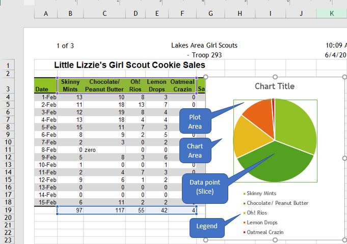
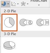
A pie chart can only include a single series of data, whether it is a single column or a single row of data. A data series is the sequence of values that Excel uses to plot in a chart. Each value from the data series is represented by a slice (or wedge) of the pie. The size of each slice varies with its percentage of the total of the entire data series. To create a pie chart, first carefully select the appropriate data range before selecting the chart type from the Insert tab. In the above chart, the selected data range is $B$3:$F$3, $B$19:$F$19, since the only data series being charted is the total sales (quantity) of each cookie flavor. Every date (row) represents an additional data series, but since pie charts only plot a single data series, these series’ should not be selected. Pie charts should be avoided when there are many categories, or when categories do not total 100%. Typically, 2-D charts are easier to read than 3-D charts.
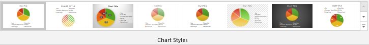
When a chart is created as an object on a worksheet, sizing handles will appear on the outer borders. The chart, or any object within the chart, can be moved and/or resized similarly to a picture or other objects in Microsoft Office. When a pie chart is first created, Excel will use the default colors and design. Users can customize the chart look easily by utilizing chart styles. In the Design contextual tab of the Ribbon, a number of different styles will be displayed in a row. Mouse over them to see a preview:
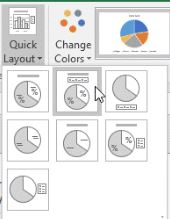
An additional option for quickly changing the look of a chart is to utilize the Quick Layout menu to select one of several preset to add elements like percentage labels, value labels, and differently located legends to the chart.
Users can also add and remove individual elements, such as chart titles, data labels, data tables, and more by using the Add Chart Element menu.
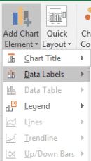
Some elements are not available for certain chart types. One of the most useful chart elements that get added manually to a chart are data labels.
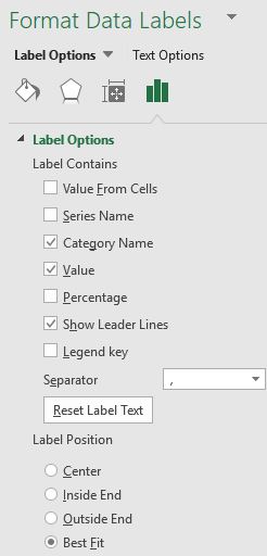
Data labels are linked to values on the worksheet, and they update automatically when changes are made to these values. Data labels make a chart easier to understand because they show details about a data series or its individual data points. Users can add data labels to all data points or a specific data slice by ensuring that only the specific slice is selected. In addition to the Add Chart Element menu and quick layout options, users can add data labels by right-clicking the chart and choosing Add Data Labels from the shortcut menu. Once added, the data labels can be further modified by right-clicking the chart and choosing Format Data Labels to open the Format Data Labels task pane. One or more types of labels can be added and positioned. Adding Category Name labels make the legend redundant. Be careful not to add so many labels that the chart becomes too crowded to read!
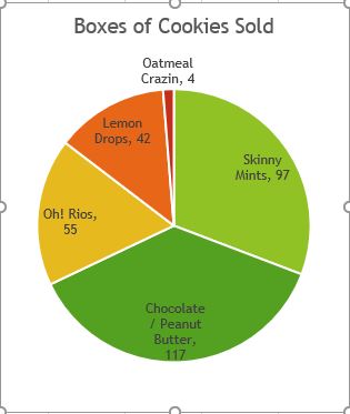
After adding labels, it may become necessary to resize or move the chart. After adding a title, data labels, and removing the legend, the chart looks different, but is still the same size, even though certain elements have resized.
Which pie chart looks better? Generally, removing the legend through use of data labels is considered a preferable design strategy. Alas, there are even more ways to customize a pie chart that is beyond the scope of this text! Additional functionality includes creating 3-D pie charts, exploding slices, rotating, sorting, adding different fill designs, and much more!