
5.10: Line Charts
- Page ID
- 14326

A line chart displays a series of data points connected by a straight line. Line charts are a good way to show change or trends over time. Line charts are simple to create and easy to read. In contrast to column or bar charts, line charts can handle more categories and more data points without becoming too cluttered. Each line displays as a different color. Line charts help people examine why data is changing and make decisions about how to proceed. The Line Chart is especially effective in displaying data trends. Stock market investors utilize line charts to track historical stock performances, and help determine if a trend can be forecasted in the future.
In a Line Chart, the vertical axis (Y-axis) always displays numeric values and the horizontal axis (X-axis) displays time or other categories. Time intervals can be measured in years, months, days, or hours.
To create a line chart, start by selecting the data range, then choosing the Line Chart button  in the Charts group from the Insert tab.
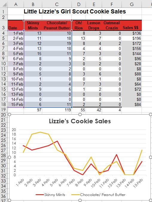
In the 2-D line chart illustrated above, two sets of data series are plotted for fifteen days. The Skinny Mints cookies are identified by the red line, and the orange line plots the Chocolate/Peanut Butter cookies. Each date is a data point. Additional data series can be added by expanding the data source range. Line charts provide an easy way to track historical data. In many cases, the way the data is trending makes it easy to predict the results of data in future periods.
Excel offers numerous other charts that might better help illustrate the story behind the data, however all charts must address the challenge of sharing or outputting the graphic(s) to their target audience(s). Here are a few printing issues to consider:
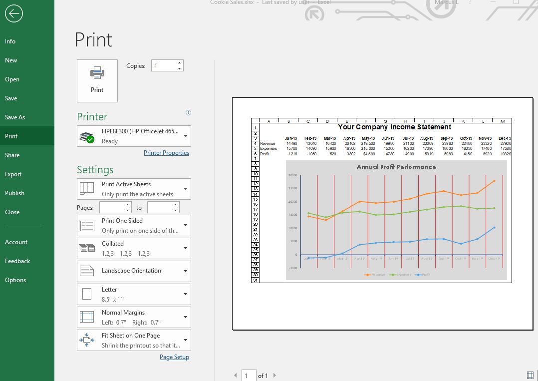
- Printing only the chart. If the active cell is not selecting the chart, both the chart and worksheet data will print. However, if the chart is currently selected, only the chart will print by default (as a chart sheet). If the intent is to print both the chart and the data, make sure to move and/or resize the chart to ensure everything fits appropriately within the sheet margins. This will embed the chart within the sheet. Utilizing the Print Preview window to verify what will print by default will allow the user to make numerous changes, such as the orientation, margins and scaling. A different installed printer can also be selected. The graphic below illustrates from the Print Preview window, an embedded line chart in landscape orientation with headings enabled for print. The sheet has also been scaled to fit to one page.
- Chart colors that are not compatible with black and white printers. A lot of office printers are black and white laser printers due to their low-cost to operate at high volumes. A color laser printer may be a worthy investment for common chart printing. If a black and white printer is all that is available, it may be necessary to change the colors to patterns or contrasting shades of grey.
- Not enough or too much information. Reads of the chart must be able to comprehend the message the chart is attempting to convey. This might require adding context, such as titles, data labels, and text-box callouts. Conversely, a chart can have too much information that the chart is cluttered and unreadable. In this case, summarizing the data my be prudent, or even re-selecting a different source data range. A chart can also be unreadable due to poor design considerations like wrong fonts and font sizes, as well as distracting colors and object sizes.
- Excel charts are volatile and will change as often as the source data is changed. If a static copy of a chart is needed, consider saving the chart as a picture. This can be accomplished through using the copy and paste special commands. Using Paste Special will allow a chart to pasted in either PNG, JPEG, GIF or other formats. Alternatively, Excel files can be saved as PDF files for inserting in other electronic documents/files.
Practice 8: Weather Report
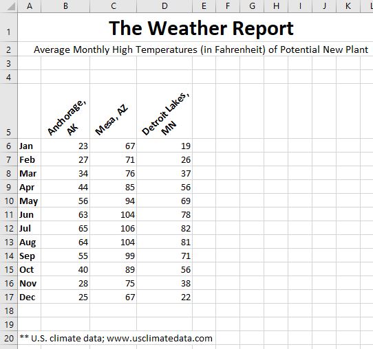
- Open the data file The Weather Report.xlsx or create a new sheet from the illustration at right.
- Add conditional formatting to all cells in B6:E17 so that any cell is at least 90° with red fill cell formatting, or below 32° in light blue fill.
- Use the Internet to research average monthly high temps for Fort Myers, FL. Enter a label and the temps in column E. The conditional formatting should dynamically format the cells.
- Create a 2-D bar chart of Anchorage and Mesa temps for all twelve months.
- Move the bar chart to its own chart sheet.
- Return to the original source data sheet and create an embedded 2-D line chart with markers for all four cities for all twelve months. Change the chart title to Average Month High Temps. Move the chart slightly so the top-left edge is in cell F6.
- Use Print Preview to view the entire sheet (not just the chart). Change the orientation to landscape. Compare your results with the screenshot below:
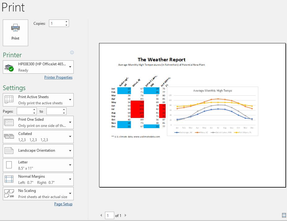
- Save the file as The Weather Report2.xlsx to your hard drive.