
3.3: Compositional Principles — Strategies for Arranging Things Better
- Page ID
- 9519
\( \newcommand{\vecs}[1]{\overset { \scriptstyle \rightharpoonup} {\mathbf{#1}} } \)
\( \newcommand{\vecd}[1]{\overset{-\!-\!\rightharpoonup}{\vphantom{a}\smash {#1}}} \)
\( \newcommand{\id}{\mathrm{id}}\) \( \newcommand{\Span}{\mathrm{span}}\)
( \newcommand{\kernel}{\mathrm{null}\,}\) \( \newcommand{\range}{\mathrm{range}\,}\)
\( \newcommand{\RealPart}{\mathrm{Re}}\) \( \newcommand{\ImaginaryPart}{\mathrm{Im}}\)
\( \newcommand{\Argument}{\mathrm{Arg}}\) \( \newcommand{\norm}[1]{\| #1 \|}\)
\( \newcommand{\inner}[2]{\langle #1, #2 \rangle}\)
\( \newcommand{\Span}{\mathrm{span}}\)
\( \newcommand{\id}{\mathrm{id}}\)
\( \newcommand{\Span}{\mathrm{span}}\)
\( \newcommand{\kernel}{\mathrm{null}\,}\)
\( \newcommand{\range}{\mathrm{range}\,}\)
\( \newcommand{\RealPart}{\mathrm{Re}}\)
\( \newcommand{\ImaginaryPart}{\mathrm{Im}}\)
\( \newcommand{\Argument}{\mathrm{Arg}}\)
\( \newcommand{\norm}[1]{\| #1 \|}\)
\( \newcommand{\inner}[2]{\langle #1, #2 \rangle}\)
\( \newcommand{\Span}{\mathrm{span}}\) \( \newcommand{\AA}{\unicode[.8,0]{x212B}}\)
\( \newcommand{\vectorA}[1]{\vec{#1}} % arrow\)
\( \newcommand{\vectorAt}[1]{\vec{\text{#1}}} % arrow\)
\( \newcommand{\vectorB}[1]{\overset { \scriptstyle \rightharpoonup} {\mathbf{#1}} } \)
\( \newcommand{\vectorC}[1]{\textbf{#1}} \)
\( \newcommand{\vectorD}[1]{\overrightarrow{#1}} \)
\( \newcommand{\vectorDt}[1]{\overrightarrow{\text{#1}}} \)
\( \newcommand{\vectE}[1]{\overset{-\!-\!\rightharpoonup}{\vphantom{a}\smash{\mathbf {#1}}}} \)
\( \newcommand{\vecs}[1]{\overset { \scriptstyle \rightharpoonup} {\mathbf{#1}} } \)
\( \newcommand{\vecd}[1]{\overset{-\!-\!\rightharpoonup}{\vphantom{a}\smash {#1}}} \)
\(\newcommand{\avec}{\mathbf a}\) \(\newcommand{\bvec}{\mathbf b}\) \(\newcommand{\cvec}{\mathbf c}\) \(\newcommand{\dvec}{\mathbf d}\) \(\newcommand{\dtil}{\widetilde{\mathbf d}}\) \(\newcommand{\evec}{\mathbf e}\) \(\newcommand{\fvec}{\mathbf f}\) \(\newcommand{\nvec}{\mathbf n}\) \(\newcommand{\pvec}{\mathbf p}\) \(\newcommand{\qvec}{\mathbf q}\) \(\newcommand{\svec}{\mathbf s}\) \(\newcommand{\tvec}{\mathbf t}\) \(\newcommand{\uvec}{\mathbf u}\) \(\newcommand{\vvec}{\mathbf v}\) \(\newcommand{\wvec}{\mathbf w}\) \(\newcommand{\xvec}{\mathbf x}\) \(\newcommand{\yvec}{\mathbf y}\) \(\newcommand{\zvec}{\mathbf z}\) \(\newcommand{\rvec}{\mathbf r}\) \(\newcommand{\mvec}{\mathbf m}\) \(\newcommand{\zerovec}{\mathbf 0}\) \(\newcommand{\onevec}{\mathbf 1}\) \(\newcommand{\real}{\mathbb R}\) \(\newcommand{\twovec}[2]{\left[\begin{array}{r}#1 \\ #2 \end{array}\right]}\) \(\newcommand{\ctwovec}[2]{\left[\begin{array}{c}#1 \\ #2 \end{array}\right]}\) \(\newcommand{\threevec}[3]{\left[\begin{array}{r}#1 \\ #2 \\ #3 \end{array}\right]}\) \(\newcommand{\cthreevec}[3]{\left[\begin{array}{c}#1 \\ #2 \\ #3 \end{array}\right]}\) \(\newcommand{\fourvec}[4]{\left[\begin{array}{r}#1 \\ #2 \\ #3 \\ #4 \end{array}\right]}\) \(\newcommand{\cfourvec}[4]{\left[\begin{array}{c}#1 \\ #2 \\ #3 \\ #4 \end{array}\right]}\) \(\newcommand{\fivevec}[5]{\left[\begin{array}{r}#1 \\ #2 \\ #3 \\ #4 \\ #5 \\ \end{array}\right]}\) \(\newcommand{\cfivevec}[5]{\left[\begin{array}{c}#1 \\ #2 \\ #3 \\ #4 \\ #5 \\ \end{array}\right]}\) \(\newcommand{\mattwo}[4]{\left[\begin{array}{rr}#1 \amp #2 \\ #3 \amp #4 \\ \end{array}\right]}\) \(\newcommand{\laspan}[1]{\text{Span}\{#1\}}\) \(\newcommand{\bcal}{\cal B}\) \(\newcommand{\ccal}{\cal C}\) \(\newcommand{\scal}{\cal S}\) \(\newcommand{\wcal}{\cal W}\) \(\newcommand{\ecal}{\cal E}\) \(\newcommand{\coords}[2]{\left\{#1\right\}_{#2}}\) \(\newcommand{\gray}[1]{\color{gray}{#1}}\) \(\newcommand{\lgray}[1]{\color{lightgray}{#1}}\) \(\newcommand{\rank}{\operatorname{rank}}\) \(\newcommand{\row}{\text{Row}}\) \(\newcommand{\col}{\text{Col}}\) \(\renewcommand{\row}{\text{Row}}\) \(\newcommand{\nul}{\text{Nul}}\) \(\newcommand{\var}{\text{Var}}\) \(\newcommand{\corr}{\text{corr}}\) \(\newcommand{\len}[1]{\left|#1\right|}\) \(\newcommand{\bbar}{\overline{\bvec}}\) \(\newcommand{\bhat}{\widehat{\bvec}}\) \(\newcommand{\bperp}{\bvec^\perp}\) \(\newcommand{\xhat}{\widehat{\xvec}}\) \(\newcommand{\vhat}{\widehat{\vvec}}\) \(\newcommand{\uhat}{\widehat{\uvec}}\) \(\newcommand{\what}{\widehat{\wvec}}\) \(\newcommand{\Sighat}{\widehat{\Sigma}}\) \(\newcommand{\lt}{<}\) \(\newcommand{\gt}{>}\) \(\newcommand{\amp}{&}\) \(\definecolor{fillinmathshade}{gray}{0.9}\)We have many words for the frustration we feel when an interface isn’t directing us to what we need to know. Loud, messy, cluttered, busy. These words. . . express our feeling of being overwhelmed visually by content on a screen or page. We need them to express how unpleasant a user experience it is to not know where to direct our attention next. (Porter, 2010, para 1)
If everything is equal, nothing stands out. (Bradley, 2011)
The proper composition of visual elements generates not only visual stability, it enhances mood through composition and generates order that prevents visual chaos. Designers use compositional rules in their work to make the reader enter their work and experience a design environment that is calm yet exciting, quiet yet interesting. A magazine designer, for example, creates a grid and applies an order to the typographic elements creating a comprehensible hierarchy. This design system is interpreted in different ways, in pages and spreads, issue after issue. If the organizational system is versatile and planned with thought and depth, it can be used to produce unique and exciting layouts that remain true to the rules determined for the overall system initially designed. Organizational principles create a framework for design without determining the end results.
Compositional rules can be used to generate content as well as organize it. The Bauhaus artist and designer Laszlo Moholy-Nagy created a series of paintings by calling in a set of instructions to a sign painter using the telephone. Here is his account of the experience, written in 1944:
In 1922 I ordered by telephone from a sign factory five paintings in porcelain enamel. I had the factory’s color chart before me and I sketched my paintings on graph paper. At the other end of the telephone, the factory supervisor had the same kind of paper divided in to squares. He took down the dictated shapes in the correct position. (It was like playing chess by correspondence). (Moholy-Nagy, 1947, p. 79)
Designing visual elements into a strong composition is a complex endeavour on its own, but increasingly designers are being asked to create vast compositional systems that other people will implement. Much like Laszlo Moholy-Nagy, designers need to be able to make strong compositional systems and also convey how their systems work, how to apply their rules, and how to apply them so they retain a relevant freshness.
Alignment

Alignment refers to lining up the top, bottom, sides, or middle of a text, composition, or grouping of graphic elements on a page. Often a design composition includes a grid where the alignment of text blocks is dictated by the design of the columns of the grid (see Figure 3.17).
Typographically, horizontal alignment includes flush left (also called left justified or ragged right), flush right (also called right justified or ragged left), centred, and fully justified. Vertical alignment in typography is usually linked to baseline alignment. A baseline grid exists in digital software that is meant for layout of type and is the invisible line where font characters sit.
Contrast
Contrast is a visual device that increases the special character of both elements that have been paired. Contrast assists composition by creating focal points, and adds energy and visual range to a composition. Using contrast enables us to distinguish the qualities of one object by comparing differences with another. Some ways of creating contrast among elements in the design include the use of contrasting colours, sizes, and shapes. Johannes Itten, a design instructor and artist at the Bauhaus focused his research on the concept of contrast in both composition and colour. Itten’s list of contrasts can be applied to both the composition and the atmosphere of a design work. His list includes these pairings: large/small, hard/soft, thick/thin, light/heavy, straight/curved, continuous/intermittent, much/little, sweet/sour, pointed/blunt, light/dark, loud/soft, black/white, strong/weak, diagonal/circular. No design makes use of only one kind of contrast, but usually one dominates the others.
Colour Contrast
Johannes Itten also worked with contrast in his seminal theory of colour and determined that there are seven kinds of contrast.
- Contrast of hue occurs when a hue or colour is separated by being outlined in black or white lines. White lines weaken the ‘strength’ and appearance of the colour and the colours around the white lines seem darker. In contrast, a black line around a colour strengthens the appearance of the colour, while the colours around the black lines appear to be lighter.
- Light-dark contrast is the contrast between light values and dark values.
- Cold-warm contrast refers to the contrast between cool and warm colours. Warm colours are the red, orange, and yellow colours of the colour wheel, while cool colours are blue, green, and purple.
- Complementary contrast is the contrast between colours directly opposite each other on the colour wheel.
- Simultaneous contrast occurs between two colours that are almost complementary. One colour is one section to the left or right of the complementary colour of the other.
- Contrast of saturation refers to the contrast between intense colours and tertiary or muted colors. Muted colours appear duller when placed next to intense colours, and intense colours appear more vivid when next to a muted colour.
- Contrast of extension refers to the contrast between the area of one colour and another. Different areas of one colour are needed to balance another.
For text, contrast is achieved by using varied colours, serif and sans serif, type styles that are not often paired, or type in place of an image. As contrast in elements diminishes, the elements begin to feel similar, and the level of visual interest decreases.
Emphasis
A focal point in a composition draws the eye to it before the eye engages with the rest of the visual information. This is called emphasis and is achieved by making a specific element gain the attention of the eye. Emphasis is created in graphic design by making only one focal point and clearly emphasizing it by placing the elements on the page in positions where the eye is naturally drawn to the proper entry into the work. Designers rely on additional compositional principles to support the hierarchy of a composition such as contrast, repetition, or movement.
Designers use emphasis to assist viewers in identifying the relative importance of each element in a composition. Emphasis is strongly linked to visual hierarchy. Both emphasis and visual hierarchy create order for the viewer, allowing the eye to see the first element of importance, then the second, then the third, and so on. Graphic elements gain or lose emphasis by changing in size, visual intensity, colour, complexity, uniqueness, placement on the page, and relationship to other elements.
Movement
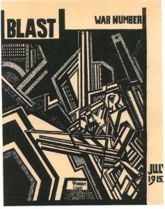
Movement is made by creating visual instability — like motion in a photograph that blurs the image, as shown in the example in Figure 3.18. Creating the illusion of movement photographically or artistically is not difficult because a blur translates into movement in the mind of the viewer. However, it is not the only option for a designer. A composition can also achieve movement if the graphic elements are arranged in a way that directs the eye to move in a specific direction — usually by creating a diagonal that takes the eye up to the right corner (forward motion) or down to the left corner (backward motion). Movement can also be created using overlapping planes that imply depth and distance by becoming progressively smaller and lighter in tone (mimicking depth). Using typography as a visual medium is also an option. Overlapping the text blocks and/or sentences effectively creates both depth and movement (though it destroys legibility). David Carson is a designer who often uses this technique to create movement in his work.
Scale
Varying scale (size) is one of the major tools in the designer’s toolbox. Changing scale is important on two levels. The first is purely compositional — a composition needs variety in the size of its elements to be dynamic and effective. If all the elements have the same visual weight, the composition will be flat. Another aspect to varied scale is conceptual. If a design visually distorts the size relation of one element to another, the viewer is instantly engaged in discovering why. This is a great method to engage the viewer and add a twist to the message embedded in the design. A great example of this is the ‘think small’ ad campaign of the 1960s for Volkswagen Beetle.
The series is witty and engaging and plays on how we perceive size. This distortion is witty and playful, and presents smallness as desirable. Subtle scale differences do not make much visual impact, but large ones are very dramatic. The concept and context of a project should determine the relationship of scale differences for a composition. Large differences in scale are suited to dramatic and energetic design content, while smaller differences in scale are appropriate for professional and institutional content.
Proximity and the Gestalt Theory of Visual Relationships
Proximity of elements is part of Gestalt theory, which is a framework of spatial relationships developed in the 1920s by the German psychologists Max Wertheimer, Wolfgang Kohler, and Kurt Koffka. The term Gestalt means unified whole, and points to the underlying conceptual structure of this framework. Gestalt works because the mind seeks to organize visual information. A composition created using Gestalt principles predetermines how each of the elements within it interacts with the others spatially. In this system of relationships, close proximity of objects, regardless of shape, size, or content, indicates a connection. There are six basic Gestalt principles: (1) similarity, (2) continuation, (3) closure, (4) proximity, (5) figure/ground, and (6) symmetry and order.
Similarity
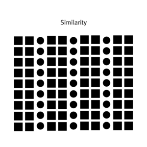
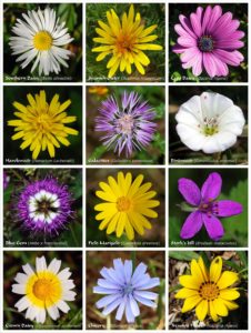
When visual elements have a similar shape or look as one another, a viewer will often connect the discrete components and see a pattern or grouping (see Figure 3.19). This effect can be used to create a single illustration, image, or message from a series of separate elements. Similarity of medium, shape, size, colour, or texture will trigger a sense of similarity. The sense of grouping will be strengthened or weakened by increasing or decreasing the commonality of the individual elements.
Continuation
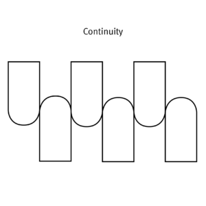
Continuation is the tendency of the mind to see a single continuous line of connection rather than discrete components (see Figure 3.20). The eye is drawn along a path, line, or curve, as long as there is enough proximity between objects to do so. This tendency can be used to point toward another element in the composition, or to draw the eye around a composition. The eye will continue along the path or direction suggested by the composition even when the composition ends, continuing beyond the page dimensions.
Closure
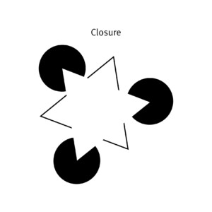
Closure is a design technique that uses the mind’s tendency to complete incomplete shapes (see Figure 3.21). The principle works if the viewer is given enough visual information to perceive a complete shape in the negative space. In essence, the mind ‘closes’ a form, object, or composition. In the example above , the triangle is formed by the viewer’s mind, which wants to close the shape formed by the gaps and spaces of the adjacent circles and lines. The partial triangle, outlined in black also hints at the missing shape.
Proximity
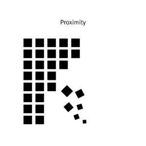
Proximity is an arrangement of elements that creates an association or relationship between them (see Figure 3.22). If individual elements are similar, they will probably be perceived first as a whole and second as discrete components. If, like the example above, some of the components form to create a large ‘whole,’ similar elements positioned away from the main shape will also be associated with the large shape. In this case, the viewer interprets them as falling off or away from the main shape. The shapes used do not have to be geometric to create the effect of proximity. Any components have a strong commonality in shape, colour, texture, size, or other visual attribute can achieve proximity. Proximity can also be achieved with dissimilar shapes and textures if cleverly and conceptually composed.
Figure/Ground
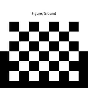
Figure/ground was discussed earlier, but it is part of Gestalt theory, so we present it here again. This principle describes the mind’s tendency to see as two different planes of focus, information in both positive and negative space (see Figure 3.23). It works if those spaces are suggestive enough in their composition.
Symmetry and Order
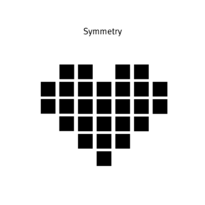
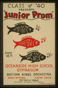
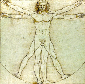
Symmetry and order follow the premise that a composition should not create a sense of disorder or imbalance (see Figure 3.24), because the viewer will waste time trying to mentally reorder it rather than focus on the embedded content. The photographic example in Figure 3.25 is composed symmetrically and allows the viewer to concentrate on the figure in the centre. Achieving symmetry in a composition also gives the composition balance and a feeling of harmony.
Rhythm
Rhythm is integral to the pacing of a design composition and is also necessary for creating a pattern, as used in the example in Figure 3.26. The pacing of a repeating motif or element at regular or irregular intervals within a design determines the energetic quality of a composition; it also creates a consistent and unifying backdrop for the introduction of new elements.
Rhythm is the effect produced in a magazine or book by varying the placement of elements within the grid structure. The changes in the density of elements and visual tones of the spreads translate into a rhythmic visual energy as the energy of each page grows or shrinks. Rhythm is the glue that connects one page to the next; it reveals recurrent themes and creates movement, tension, and emotional value in the content. When viewers understand the rhythm of a book, a magazine, or a website, they will also appreciate the variations that break with or punctuate the rhythm and create interest, change, or tension.
Repetition
Repetition creates visual consistency in page designs or in visual identities, such as using the same style of headline, the same style of initial capitals, and the same set of elements, or repeating the same basic layout from one page to another (see Figure 3.27).
Excessive repetition, however, creates monotony. This usually leads to viewer boredom and dull, uninteresting compositions for the designer. Be sure to create a design system that allows the repetitions within it to be lively and interesting page after page. The example above uses a simple set of rules, but because the rules allow for colour and compositional changes, each discrete component is as interesting on its own as it is within the whole. If you cannot avoid excessive repetitions, try to add some visual breaks and white spaces where the eyes can rest for a while.
Balance
Balance and symmetry are important design qualities because they are deeply embedded in human DNA. Because our bodies are symmetrical, we have a strong association and satisfaction with centred, symmetrical design. Balancing visual elements compositionally calms the tensions and grounds the design (see Figure 3.28). This is important if you wish to convey a sense of stability to the viewer. When we look at a design, we use our innate sense of what constitutes ‘right balance’ to assess its stability. If that stability is missing, we feel tension, which can counteract the core of the message. Centred design compositions work very well for stable, security-inspiring content, but what about content that demands attention, or tension, or excitement?
When a centred (or stable) composition is not desirable, developing an asymmetrical composition is the best strategy. Asymmetry has been explored in graphic design for the last 150 years, and designers continue to discover new strategies that feel fresh. Asymmetry has no empirical rules but is guided by balancing the distribution of main elements around the space of a composition in an unexpected way. Contrast and counterpoint are the main tools of composition in asymmetry — large shapes balance small ones; intense colours balance neutrals. Creating asymmetrical design is not easy because there are no firm rules to follow, but it is exciting to create and exciting to see for exactly the same reason.
Hierarchy: Dominance and Emphasis
Simply put, hierarchy is applying an order of importance to a set of elements. Hierarchical order is apparent in every facet of our lives and is a defining characteristic of our contemporary culture. Hierarchy can be very complex and rigorous — an instruction manual is a good example of this. It can also be uncomplicated and loose. Hierarchy in composition is conveyed visually through variations of all the elements — size, colour, placement, tonal value, and so on (see Figure 3.29).
Graphic design does not always embrace hierarchy. There are some messages that are more suited to visual anarchy and chaos (Punk design is a good example). These projects often connect to an audience by experimenting with, and breaking free from universal rules of visual structure. It is important is to match the structure of the composition to the needs of the project.
Typographic hierarchy is very important in design. A body of text is made more comprehensible by imposing order through a system of titles, subtitles, sections, and subsections. Hierarchy is created when the levels of the hierarchy are clear and distinguishable from one another. Subtle signs of difference are not effective. Typography acts as a tonal voice for the viewer, and must create clear variation in tone, pitch, and melody.
Hierarchy is usually created using similarity and contrast. Similar elements have equality in typographic hierarchy. Dominant and subordinate roles are assigned to elements when there is enough contrast between them. The bigger and darker an element is, the more importance it has. Smaller and lighter sizes and tones imply lesser importance.
Every hierarchy has a most important level and a least important level. The elements that fall between the two are ranked according to size and position. However, if you subdivide the text with too many levels, the contrast between different levels will blur their differences in the hierarchical order.
A good strategy to follow with text design is to apply three levels of typographic hierarchy.
Title
The function of a title is to attract the reader to the content of the text block. Often, the title is visually ‘flavourful’ and possesses a strong visual dynamic and energy.
Subtitle
Second-level typography gives the reader the ability to distinguish between types of information within the text block. This level of type includes subheads, pull quotes, captions, and anything else that can help detail and support understanding of the text-block information.
Text block
The text block is the content. As opposed to the ‘display’ function of the title and subtitle, the function of the text block is to make the content legible and easy to digest visually. Readers should be able to decide if they want to read this level based on primary (title) and secondary (subtitle) type levels.
Typically, a typographic hierarchy will convey information from general to specific as it progresses from title to text block. The general points presented in the title will be the most important and will be seen by most everyone. Think of how a newspaper is scanned for interesting news items: If readers are interested in the title, they may choose to read more detailed and in-depth information in the associated text block.
Media Attributions
- alignment by Ken Jeffrey
- Blast2_movement by Wyndham Lewis © Public Domain
- gestalt_similarity-01 by Ken Jeffrey
- gestalt_continuity-02 by Ken Jeffrey
- gestalt_closure-03 by Ken Jeffrey
- gestalt_proximity-04 by Ken Jeffrey
- gestalt_figureground-05 by Ken Jeffrey
- gestalt_symmetry-06 by Ken Jeffrey
- Chicago_world’s_fair by Weimer Pursell © Public Domain
- Class_of_’40_presents_LCCN98513436 by Library of Congress © Public Domain
- Flower_poster by Alvesgaspar © CC BY-SA (Attribution ShareAlike)
- Da_Vinci_Vitruve_Luc_Viatour2 by Leonardo da Vinci © Public Domain