6.4: Accordions
- Page ID
- 15622
\( \newcommand{\vecs}[1]{\overset { \scriptstyle \rightharpoonup} {\mathbf{#1}} } \)
\( \newcommand{\vecd}[1]{\overset{-\!-\!\rightharpoonup}{\vphantom{a}\smash {#1}}} \)
\( \newcommand{\id}{\mathrm{id}}\) \( \newcommand{\Span}{\mathrm{span}}\)
( \newcommand{\kernel}{\mathrm{null}\,}\) \( \newcommand{\range}{\mathrm{range}\,}\)
\( \newcommand{\RealPart}{\mathrm{Re}}\) \( \newcommand{\ImaginaryPart}{\mathrm{Im}}\)
\( \newcommand{\Argument}{\mathrm{Arg}}\) \( \newcommand{\norm}[1]{\| #1 \|}\)
\( \newcommand{\inner}[2]{\langle #1, #2 \rangle}\)
\( \newcommand{\Span}{\mathrm{span}}\)
\( \newcommand{\id}{\mathrm{id}}\)
\( \newcommand{\Span}{\mathrm{span}}\)
\( \newcommand{\kernel}{\mathrm{null}\,}\)
\( \newcommand{\range}{\mathrm{range}\,}\)
\( \newcommand{\RealPart}{\mathrm{Re}}\)
\( \newcommand{\ImaginaryPart}{\mathrm{Im}}\)
\( \newcommand{\Argument}{\mathrm{Arg}}\)
\( \newcommand{\norm}[1]{\| #1 \|}\)
\( \newcommand{\inner}[2]{\langle #1, #2 \rangle}\)
\( \newcommand{\Span}{\mathrm{span}}\) \( \newcommand{\AA}{\unicode[.8,0]{x212B}}\)
\( \newcommand{\vectorA}[1]{\vec{#1}} % arrow\)
\( \newcommand{\vectorAt}[1]{\vec{\text{#1}}} % arrow\)
\( \newcommand{\vectorB}[1]{\overset { \scriptstyle \rightharpoonup} {\mathbf{#1}} } \)
\( \newcommand{\vectorC}[1]{\textbf{#1}} \)
\( \newcommand{\vectorD}[1]{\overrightarrow{#1}} \)
\( \newcommand{\vectorDt}[1]{\overrightarrow{\text{#1}}} \)
\( \newcommand{\vectE}[1]{\overset{-\!-\!\rightharpoonup}{\vphantom{a}\smash{\mathbf {#1}}}} \)
\( \newcommand{\vecs}[1]{\overset { \scriptstyle \rightharpoonup} {\mathbf{#1}} } \)
\( \newcommand{\vecd}[1]{\overset{-\!-\!\rightharpoonup}{\vphantom{a}\smash {#1}}} \)
\(\newcommand{\avec}{\mathbf a}\) \(\newcommand{\bvec}{\mathbf b}\) \(\newcommand{\cvec}{\mathbf c}\) \(\newcommand{\dvec}{\mathbf d}\) \(\newcommand{\dtil}{\widetilde{\mathbf d}}\) \(\newcommand{\evec}{\mathbf e}\) \(\newcommand{\fvec}{\mathbf f}\) \(\newcommand{\nvec}{\mathbf n}\) \(\newcommand{\pvec}{\mathbf p}\) \(\newcommand{\qvec}{\mathbf q}\) \(\newcommand{\svec}{\mathbf s}\) \(\newcommand{\tvec}{\mathbf t}\) \(\newcommand{\uvec}{\mathbf u}\) \(\newcommand{\vvec}{\mathbf v}\) \(\newcommand{\wvec}{\mathbf w}\) \(\newcommand{\xvec}{\mathbf x}\) \(\newcommand{\yvec}{\mathbf y}\) \(\newcommand{\zvec}{\mathbf z}\) \(\newcommand{\rvec}{\mathbf r}\) \(\newcommand{\mvec}{\mathbf m}\) \(\newcommand{\zerovec}{\mathbf 0}\) \(\newcommand{\onevec}{\mathbf 1}\) \(\newcommand{\real}{\mathbb R}\) \(\newcommand{\twovec}[2]{\left[\begin{array}{r}#1 \\ #2 \end{array}\right]}\) \(\newcommand{\ctwovec}[2]{\left[\begin{array}{c}#1 \\ #2 \end{array}\right]}\) \(\newcommand{\threevec}[3]{\left[\begin{array}{r}#1 \\ #2 \\ #3 \end{array}\right]}\) \(\newcommand{\cthreevec}[3]{\left[\begin{array}{c}#1 \\ #2 \\ #3 \end{array}\right]}\) \(\newcommand{\fourvec}[4]{\left[\begin{array}{r}#1 \\ #2 \\ #3 \\ #4 \end{array}\right]}\) \(\newcommand{\cfourvec}[4]{\left[\begin{array}{c}#1 \\ #2 \\ #3 \\ #4 \end{array}\right]}\) \(\newcommand{\fivevec}[5]{\left[\begin{array}{r}#1 \\ #2 \\ #3 \\ #4 \\ #5 \\ \end{array}\right]}\) \(\newcommand{\cfivevec}[5]{\left[\begin{array}{c}#1 \\ #2 \\ #3 \\ #4 \\ #5 \\ \end{array}\right]}\) \(\newcommand{\mattwo}[4]{\left[\begin{array}{rr}#1 \amp #2 \\ #3 \amp #4 \\ \end{array}\right]}\) \(\newcommand{\laspan}[1]{\text{Span}\{#1\}}\) \(\newcommand{\bcal}{\cal B}\) \(\newcommand{\ccal}{\cal C}\) \(\newcommand{\scal}{\cal S}\) \(\newcommand{\wcal}{\cal W}\) \(\newcommand{\ecal}{\cal E}\) \(\newcommand{\coords}[2]{\left\{#1\right\}_{#2}}\) \(\newcommand{\gray}[1]{\color{gray}{#1}}\) \(\newcommand{\lgray}[1]{\color{lightgray}{#1}}\) \(\newcommand{\rank}{\operatorname{rank}}\) \(\newcommand{\row}{\text{Row}}\) \(\newcommand{\col}{\text{Col}}\) \(\renewcommand{\row}{\text{Row}}\) \(\newcommand{\nul}{\text{Nul}}\) \(\newcommand{\var}{\text{Var}}\) \(\newcommand{\corr}{\text{corr}}\) \(\newcommand{\len}[1]{\left|#1\right|}\) \(\newcommand{\bbar}{\overline{\bvec}}\) \(\newcommand{\bhat}{\widehat{\bvec}}\) \(\newcommand{\bperp}{\bvec^\perp}\) \(\newcommand{\xhat}{\widehat{\xvec}}\) \(\newcommand{\vhat}{\widehat{\vvec}}\) \(\newcommand{\uhat}{\widehat{\uvec}}\) \(\newcommand{\what}{\widehat{\wvec}}\) \(\newcommand{\Sighat}{\widehat{\Sigma}}\) \(\newcommand{\lt}{<}\) \(\newcommand{\gt}{>}\) \(\newcommand{\amp}{&}\) \(\definecolor{fillinmathshade}{gray}{0.9}\)Accordion widgets can come in single or multi-select formats, in which one or multiple panels can be opened at once, respectively. They are typically used to reduce the space that content occupies and to reduce scrolling. Accordions are made up of Accordion Headers and AccordionPanels. The accordion headers control the display of their associated accordion panel.
The WAI-ARIA roles, states, and properties used in an accordion
- aria-multiselectable =”(true | false)”
- role=”heading”
- role=”button”
- aria-controls=”[panel id]”
- tabindex=”0″
- role=”region”
- aria-hidden= “(true | false)”
- aria-expanded= “(true | false)”
The following JSFiddle presents a typical accordion widget. Review the JavaScript and HTML markup. Test the accordion presented under the Result tab with ChromeVox to understand how it functions without any accessibility features added. You can work in JSFiddle itself by clicking “Edit in JSFiddle”, copying the accessibility/WAI-ARIA code described below to fix the accessibility of the accordion before completing Activity 9 on the page that follows.
First, add the accordion to the landmarked regions by assigning role="region" to the opening <DL> element when the accordion is initialized, adding the region role to the init() function.
Next, add the aria-multiselectable attribute to the <DL>, which will be dynamically set to true or false based on plugin configuration settings. This lets a user know that more than one accordion panel can be opened when set to TRUE or only a single panel when set to FALSE. Refer to the $(document).ready block in the HTML, where the assignment takes place.
The semantics of the children of the <DL> element, which was assigned role="presentation", will also have their definition list semantics removed. Add the accordion semantics role="heading" to assign a heading role to the <DT> elements. The aria-level attribute might be used to implement nested accordion panels, but for our purpose here a simplified version is sufficient.
Add a <div> inside the header (i.e., DT) and define its role as a button. The button is given an aria-controls attribute to define which of the accordion panels it controls. By default the toggle state is set to false with aria-expanded="false" to be updated dynamically when the button is clicked or key pressed. Finally add tabindex="0" to the button (<div>) to make it keyboard focusable.
The tabindex will make the button focusable, but it will not make it clickable. The .on() jQuery function adds a click event to the button, but a keypress event must also be added. Adding .on('keydown') activates the onKeyDown function, defined below, so the accordion headers operate with both a mouse click and a keypress.
In the togglePanel() function, before autoCollapse(), add in the toggle to add and update the aria-expanded attribute for the panel headers, based on whether the associated panel is visible or not.
Within the autoCollapse() function, toggle aria-expanded="false" and aria-hidden="true" for all accordion tabs that are not the current one. This ensures only one panel is open at a time.
Finally, the accordion panel semantics are added, defining the <DD> elements that had its semantics removed when role="presentation" was added to the parent <DL>. Panels are given a generic role="region" to make the panel browsable in the landmarks list, set to be hidden by default with aria-hidden="true" so all panels are closed when the page loads. Further, tabindex="0" is also added to make the panels keyboard focusable so the content of the panel is read as the user navigates to them.
Adding Keyboard Operability
WAI-ARIA best practices defines all recommended accordion keyboard functionality, listed below. In our example, only the required keyboard events are included.
Keyboard Interaction for Accordions
- Enter or Space:
- When focus is on the accordion header for a collapsed panel, expands the associated panel. If the implementation allows only one panel to be expanded, and if another panel is expanded, collapses that panel.
- When focus is on the accordion header for an expanded panel, collapses the panel if the implementation supports collapsing. Some implementations require one panel to be expanded at all times and allow only one panel to be expanded; so they do not support a collapse function.
- Down Arrow (Optional): If focus is on an accordion header, moves focus to the next accordion header. If focus is on the last accordion header, either does nothing or moves focus to the first accordion header.
- Up Arrow (Optional): If focus is on an accordion header, moves focus to the previous accordion header. If focus is on the first accordion header, either does nothing or moves focus to the last accordion header.
- Home (Optional): When focus is on an accordion header, moves focus to the first accordion header.
- End (Optional): When focus is on an accordion header, moves focus to the last accordion header.
- Ctrl+Page Down (Optional): If focus is inside an accordion panel or on an accordion header, moves focus to the next accordion header. If focus is in the last accordion header or panel, either does nothing or moves focus to the first accordion header.
- Ctrl+Page Up (Optional): If focus is inside an accordion panel, moves focus to the header for that panel. If focus is on an accordion header, moves focus to the previous accordion header. If focus is on the first accordion header, either does nothing or moves focus to the last accordion header.
Source: WAI-ARIA Accordion Design Patterns
The following onKeyDown function has been created to add keyboard operability to the header elements of the accordion, allowing both Space bar and Enter keys to operate the toggles (i.e., headers) that open and close panels, and the Arrow keys to move between the accordion headers. By default, users can navigate between headers, and between headers and panels using the Tab key.
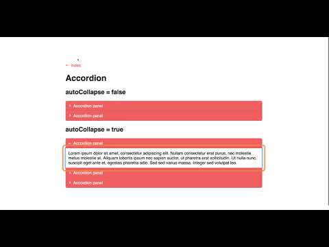
Accessible Accordion in Action
Watch the following video to see how ChromeVox interacts with an accordion. The Tab key is used to navigate into the accordions, move between accordion headers, and move between accordion headers and panels. Arrow keys can also be used to move between accordion headers, but not from headers to an associated panel. Aim to have the accordion you update in the activity on the following page operate and announce like the one in the video.
Video: Accessible Accordions


