16.1: Insert Tab
- Page ID
- 13685

\( \newcommand{\vecs}[1]{\overset { \scriptstyle \rightharpoonup} {\mathbf{#1}} } \)
\( \newcommand{\vecd}[1]{\overset{-\!-\!\rightharpoonup}{\vphantom{a}\smash {#1}}} \)
\( \newcommand{\dsum}{\displaystyle\sum\limits} \)
\( \newcommand{\dint}{\displaystyle\int\limits} \)
\( \newcommand{\dlim}{\displaystyle\lim\limits} \)
\( \newcommand{\id}{\mathrm{id}}\) \( \newcommand{\Span}{\mathrm{span}}\)
( \newcommand{\kernel}{\mathrm{null}\,}\) \( \newcommand{\range}{\mathrm{range}\,}\)
\( \newcommand{\RealPart}{\mathrm{Re}}\) \( \newcommand{\ImaginaryPart}{\mathrm{Im}}\)
\( \newcommand{\Argument}{\mathrm{Arg}}\) \( \newcommand{\norm}[1]{\| #1 \|}\)
\( \newcommand{\inner}[2]{\langle #1, #2 \rangle}\)
\( \newcommand{\Span}{\mathrm{span}}\)
\( \newcommand{\id}{\mathrm{id}}\)
\( \newcommand{\Span}{\mathrm{span}}\)
\( \newcommand{\kernel}{\mathrm{null}\,}\)
\( \newcommand{\range}{\mathrm{range}\,}\)
\( \newcommand{\RealPart}{\mathrm{Re}}\)
\( \newcommand{\ImaginaryPart}{\mathrm{Im}}\)
\( \newcommand{\Argument}{\mathrm{Arg}}\)
\( \newcommand{\norm}[1]{\| #1 \|}\)
\( \newcommand{\inner}[2]{\langle #1, #2 \rangle}\)
\( \newcommand{\Span}{\mathrm{span}}\) \( \newcommand{\AA}{\unicode[.8,0]{x212B}}\)
\( \newcommand{\vectorA}[1]{\vec{#1}} % arrow\)
\( \newcommand{\vectorAt}[1]{\vec{\text{#1}}} % arrow\)
\( \newcommand{\vectorB}[1]{\overset { \scriptstyle \rightharpoonup} {\mathbf{#1}} } \)
\( \newcommand{\vectorC}[1]{\textbf{#1}} \)
\( \newcommand{\vectorD}[1]{\overrightarrow{#1}} \)
\( \newcommand{\vectorDt}[1]{\overrightarrow{\text{#1}}} \)
\( \newcommand{\vectE}[1]{\overset{-\!-\!\rightharpoonup}{\vphantom{a}\smash{\mathbf {#1}}}} \)
\( \newcommand{\vecs}[1]{\overset { \scriptstyle \rightharpoonup} {\mathbf{#1}} } \)
\(\newcommand{\longvect}{\overrightarrow}\)
\( \newcommand{\vecd}[1]{\overset{-\!-\!\rightharpoonup}{\vphantom{a}\smash {#1}}} \)
\(\newcommand{\avec}{\mathbf a}\) \(\newcommand{\bvec}{\mathbf b}\) \(\newcommand{\cvec}{\mathbf c}\) \(\newcommand{\dvec}{\mathbf d}\) \(\newcommand{\dtil}{\widetilde{\mathbf d}}\) \(\newcommand{\evec}{\mathbf e}\) \(\newcommand{\fvec}{\mathbf f}\) \(\newcommand{\nvec}{\mathbf n}\) \(\newcommand{\pvec}{\mathbf p}\) \(\newcommand{\qvec}{\mathbf q}\) \(\newcommand{\svec}{\mathbf s}\) \(\newcommand{\tvec}{\mathbf t}\) \(\newcommand{\uvec}{\mathbf u}\) \(\newcommand{\vvec}{\mathbf v}\) \(\newcommand{\wvec}{\mathbf w}\) \(\newcommand{\xvec}{\mathbf x}\) \(\newcommand{\yvec}{\mathbf y}\) \(\newcommand{\zvec}{\mathbf z}\) \(\newcommand{\rvec}{\mathbf r}\) \(\newcommand{\mvec}{\mathbf m}\) \(\newcommand{\zerovec}{\mathbf 0}\) \(\newcommand{\onevec}{\mathbf 1}\) \(\newcommand{\real}{\mathbb R}\) \(\newcommand{\twovec}[2]{\left[\begin{array}{r}#1 \\ #2 \end{array}\right]}\) \(\newcommand{\ctwovec}[2]{\left[\begin{array}{c}#1 \\ #2 \end{array}\right]}\) \(\newcommand{\threevec}[3]{\left[\begin{array}{r}#1 \\ #2 \\ #3 \end{array}\right]}\) \(\newcommand{\cthreevec}[3]{\left[\begin{array}{c}#1 \\ #2 \\ #3 \end{array}\right]}\) \(\newcommand{\fourvec}[4]{\left[\begin{array}{r}#1 \\ #2 \\ #3 \\ #4 \end{array}\right]}\) \(\newcommand{\cfourvec}[4]{\left[\begin{array}{c}#1 \\ #2 \\ #3 \\ #4 \end{array}\right]}\) \(\newcommand{\fivevec}[5]{\left[\begin{array}{r}#1 \\ #2 \\ #3 \\ #4 \\ #5 \\ \end{array}\right]}\) \(\newcommand{\cfivevec}[5]{\left[\begin{array}{c}#1 \\ #2 \\ #3 \\ #4 \\ #5 \\ \end{array}\right]}\) \(\newcommand{\mattwo}[4]{\left[\begin{array}{rr}#1 \amp #2 \\ #3 \amp #4 \\ \end{array}\right]}\) \(\newcommand{\laspan}[1]{\text{Span}\{#1\}}\) \(\newcommand{\bcal}{\cal B}\) \(\newcommand{\ccal}{\cal C}\) \(\newcommand{\scal}{\cal S}\) \(\newcommand{\wcal}{\cal W}\) \(\newcommand{\ecal}{\cal E}\) \(\newcommand{\coords}[2]{\left\{#1\right\}_{#2}}\) \(\newcommand{\gray}[1]{\color{gray}{#1}}\) \(\newcommand{\lgray}[1]{\color{lightgray}{#1}}\) \(\newcommand{\rank}{\operatorname{rank}}\) \(\newcommand{\row}{\text{Row}}\) \(\newcommand{\col}{\text{Col}}\) \(\renewcommand{\row}{\text{Row}}\) \(\newcommand{\nul}{\text{Nul}}\) \(\newcommand{\var}{\text{Var}}\) \(\newcommand{\corr}{\text{corr}}\) \(\newcommand{\len}[1]{\left|#1\right|}\) \(\newcommand{\bbar}{\overline{\bvec}}\) \(\newcommand{\bhat}{\widehat{\bvec}}\) \(\newcommand{\bperp}{\bvec^\perp}\) \(\newcommand{\xhat}{\widehat{\xvec}}\) \(\newcommand{\vhat}{\widehat{\vvec}}\) \(\newcommand{\uhat}{\widehat{\uvec}}\) \(\newcommand{\what}{\widehat{\wvec}}\) \(\newcommand{\Sighat}{\widehat{\Sigma}}\) \(\newcommand{\lt}{<}\) \(\newcommand{\gt}{>}\) \(\newcommand{\amp}{&}\) \(\definecolor{fillinmathshade}{gray}{0.9}\)
Tables Group
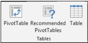
As previously described, Tables are used in excel to easily select and sort information. Excel allows the user to use tables (which allow for basic functions) and pivot tables, which are used to create the summary reports of large data sets with the built-in calculation, and we have the option to make our own calculation. Tables make it easy to sort, filter and format the data within a sheet. Excel even has a Recommended PivotTables option to automatically create Pivot Tables based upon the data provided in the highlighted cells.
To create a Pivot Table, select a cell within the table of data you wish to use. Then select Pivot Table. You may also use Recommended Pivot Tables for some predetermined templates. Regardless of which option you choose, the Pivot Table Wizard will launch and automatically select the data associated with your table that will be available in the Pivot Table. In addition, the user can select to add the Pivot Table in their current worksheet or a new worksheet. Once you have selected specific properties associated with your Pivot Table or selected the default options, click “ok” to create the Pivot Table.
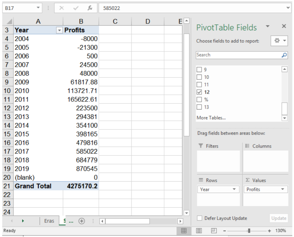
By default, the PivotTable Fields will be displayed in the upper left-hand corner. The user can select the appropriate column and determine whether it should be listed in a column, row, or values view. This flexibility allows the user to explore interrelationships between multiple data sets. While performing complex PivotTable calculations is outside the scope of this course, it is important to understand the purpose of Pivot Tables.
Illustrations Group
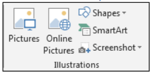
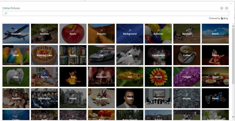
We use this option to insert the Pictures, Online Pictures, Shapes, SmartArt and Screenshot. It means if we want to insert any image, we can use Illustration feature. Selecting the Pictures icon  will allow the user to import their own picture file into Excel. Selecting Online Pictures
  will launch an Excel Online Bing Search tool to search for any picture using Bing that has a Creative Commons license that permits its free use in a document.
Once a picture is inserted into excel, it will be displayed on top of the cell and cover any contents in a cell. The picture can be manipulated with the same Picture Format tools when selected as Microsoft Word. For more information on adjusting picture properties in Microsoft Office, please visit Inserting Pictures in Chapter 12. The picture size can also be adjusted by selecting the edges of the picture and dragging resizing them to the preferred size.
Add-ins
Like Microsoft Word, Excel provides the user the option to insert Add-In Applications that operate inside of Excel to expand the functionality to the user. The default options automatically added are Bing Maps and People Graph. Depending on your Office 365 subscription or Excel license, your use of Add-ins may be limited. Users can download more add-ins by selecting the Get Add-ins icon.
Charts
Charts are one of the key uses of excel when there is a need to display numerical information graphically. In Excel, users can insert a variety of charts: Column, Bar, Radar, Line, Area, Combo, Pie and Bubbles chart. If the user doesn’t know what kind of chart to use, the can select “Recommended Charts” and Excel will automatically insert a chart from the data selected. To create a chart, select the range of cells to be included in the chart. You may include the header columns and rows if desired. Once the data is selected, simply select the preferred chart type and Excel will automatically create a chart.
Types of Charts
Excel contains a variety of charts for users to utilize to display data visually to others. Each Chart has a specific utility depending on the types of data. All charts can be customized by selecting the chart and using the Design and Format tabs which will be described later.
Pie Chart: A Pie Chart  can only display one series of data. A data series is a row or column of numbers used for charting. Excel uses the series identifier (column or row heading) as the chart title and displays the values for that series as proportional slices of a pie. If we had selected multiple series of data, Excel would ignore all but the first series. There are sub-types of the Pie Chart available. The second chart below is the Pie Chart in 3-D and the third chart is an Exploded Pie Chart; an Exploded Pie in 3-D is also available.
Column Chart: The Column & Bar Charts  shows the comparison of one or more series of data points. But the Clustered Column Chart is especially useful in comparing multiple data series. In a Column Chart, the vertical axis (Y-axis) always displays numeric values, and the horizontal axis (X-axis) displays the time or another category. And by default, Excel will always plot the category (row or column heading) that contains the most entries on the horizontal axis (X-axis). One variation of this chart type is the Stacked Column Chart. In a Stacked Column Chart, the data points for each time period are "stacked" instead of "clustered." This chart type lets us see the percentage of the total for each data point in the series. Also available is the 100% Stacked Column Chart, where each value in a series is shown as a portion of 100%. An example of a 100% Stacked Chart is shown in the section on Bar Charts. All the Column Charts have a version in which the columns display in three-dimension - as illustrated by the 3-D Stacked Column Chart above. But one chart, the "3-D Column Chart," is special because the chart itself is three-dimensional - displaying multiple series on the X-axis, Y-axis, and Z-axis. The first chart below is a 3-D Column Chart of our data series.
The Bar Chart: The Bar Chart is like a Column Chart lying on its side. The horizontal axis of a Bar Chart contains the numeric values. The first chart below is the Bar Chart for our single series, Flowers. When to use a Bar Chart versus a Column Chart depends on the type of data and user preference. Sometimes it is worth the time to create both charts and compare the results. However, Bar Charts do tend to display and compare a large number of series better than the other chart types.
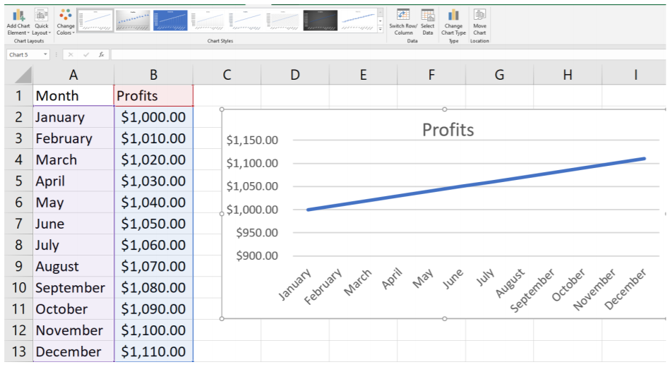
Line Chart & Area Charts: The Line Chart  is especially effective in displaying trends. In a Line Chart, the vertical axis (Y-axis) always displays numeric values and the horizontal axis (X-axis) displays the time or another category. You may choose each Line Chart type with or without markers. Markers are circles, squares, triangles, or other shapes that mark the data points. Excel displays a unique marker - different shape and/or color - for each data series. Besides the Line Chart, we have the Stacked Line Chart and the 100% Stacked Line Chart - with or without markers.
Area Chart: The Area Chart is very similar to a Line Chart with the addition that underneath the trend line is solid. Area Charts are used primarily to show trends over time. There are three charts available: the Area Chart, the Stacked Area Chart, and the 100% Stacked Area Chart. Each of these charts come in 2-D format and in true 3-D format with X, Y, and Z axes.
The Scatter Chart: The purpose of a Scatter Chart  is to observe how the values of two series compare overtime or another category. Scatterplots are similar to line graphs in that they use horizontal and vertical axes to plot data points. However, they have a very specific purpose. Scatter plots show how much one variable is affected by another. The relationship between two variables is called their correlation."
The series pair has a Positive Correlation if they increase similarly, and a Negative Correlation if they both decrease in like manner. Otherwise, they have No Correlation. The Scatter Chart comes in several different formats: markers can indicate the data points, and the points can be unconnected or connected with smooth or straight lines. Finally, there are many other types of Charts Excel provides for the user that are not described in detail in this book. The user can click on the More options arrow in the Chart Group to view all of the Chart options available to the user.
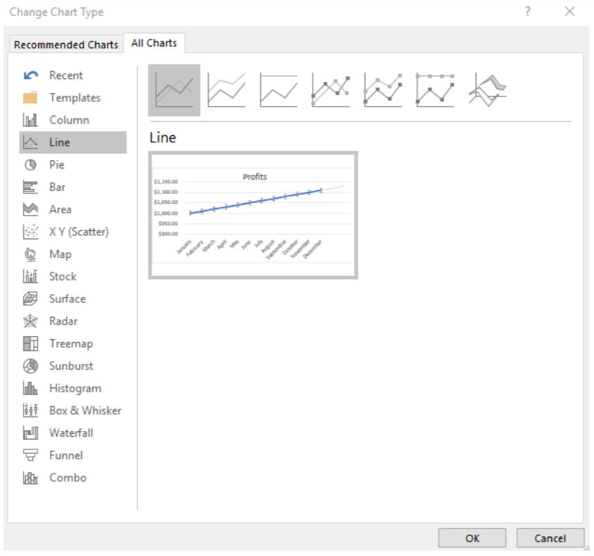
Chart Design
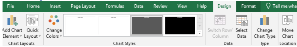
Once you have inserted a Chart, there are many options available to customize it. Users can select Design Tab (it only appears when you have first selected a chart) and have the option to choose from a variety of Chart Styles, to adjust the data or change the chart type, or add many already created quick layout elements, such as field labels or specific text properties. Users can also change the colors of the chart, or move the chart location. The most comprehensive feature to chart design is the Add Chart Elements icon that launches a drop-down menu with common chart customization features depending on the chart selected.
The Chart Data Group allows the user to toggle the row and column axis, and customize the data being reported by clicking on the Select Data icon. Once the Icon is clicked, a new dialog box will launch and allow the user to customize the data used.
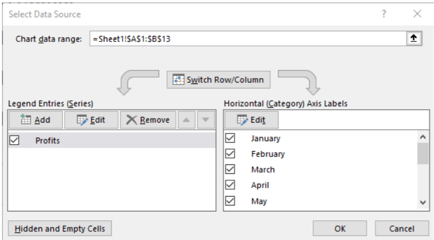
The Chart Data Range is the first customizable field. You can use it to select the data included in the chart. You can do so by manually typing in the data, or selecting the data by clicking on the specific range of cells to be included. The user can also edit the specific columns of data to be included (or not included) in the chart by selecting the Legend Entries (Series) on the left-hand side and also adjust the Horizontal Category Axis Levels on the right. Users can explore these customization options. If they ever think that they made a mistake, they can always select the Cancel button to not save the changes. Selecting OK saves the changes to the chart.
Chart Format
The Chart Formatting Tab also is available when you select a chat that you have created. The Format tab allows the user to insert shapes and lines in a chart, change the outline styles, and change the size of the Chart.
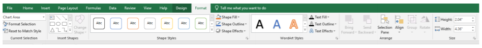
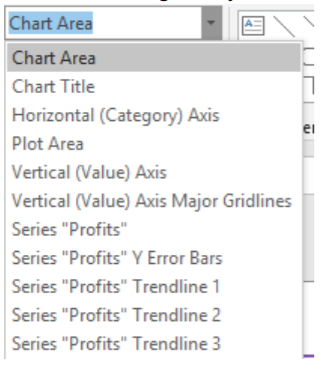
The first grouping, Current Selection allows the user to adjust the Chart Border and fill settings. While the default settings to adjust is Chart Area, any number of aspects of the chart can be adjusted.
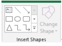
Next to the Current Selection Group is the Insert Shapes group. A wide variety of shapes, lines, boxes, and emojis can be inserted into the chart. Clicking the downward arrow in the menu of options will provide the user with even more options. In addition to shapes, new text boxes can also be inserted.
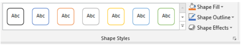
To the right of the Insert Shapes Group is the Shape Styles group. Shapes styles allow you to adjust any color or visual effect of the chart. You can choose presets for background fill of your chart, or choose your own color with the paint can icon. You can also adjust the border for the chart with the Shape Outline icon, and any transparency effects with the Shape Effects icon.
The next group, Word Art Styles focuses on text effects.
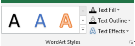
The user can choose from a variety of Word Art styles, or make their own with various Text Fill, Text Outline, and Text Effects. There is so much customization available to charts in Excel that it is possible that no two charts ever created are completely the same.
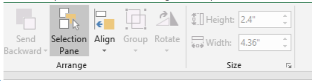
Finally, the Arrange & Selection Groups allow the user to change the shape of the chart and select between multiple charts. If eligible, a chart can be rotated, and also aligned to other charts or data on the excel spreadsheet.