5.5: Tooltips
- Page ID
- 15614
\( \newcommand{\vecs}[1]{\overset { \scriptstyle \rightharpoonup} {\mathbf{#1}} } \)
\( \newcommand{\vecd}[1]{\overset{-\!-\!\rightharpoonup}{\vphantom{a}\smash {#1}}} \)
\( \newcommand{\id}{\mathrm{id}}\) \( \newcommand{\Span}{\mathrm{span}}\)
( \newcommand{\kernel}{\mathrm{null}\,}\) \( \newcommand{\range}{\mathrm{range}\,}\)
\( \newcommand{\RealPart}{\mathrm{Re}}\) \( \newcommand{\ImaginaryPart}{\mathrm{Im}}\)
\( \newcommand{\Argument}{\mathrm{Arg}}\) \( \newcommand{\norm}[1]{\| #1 \|}\)
\( \newcommand{\inner}[2]{\langle #1, #2 \rangle}\)
\( \newcommand{\Span}{\mathrm{span}}\)
\( \newcommand{\id}{\mathrm{id}}\)
\( \newcommand{\Span}{\mathrm{span}}\)
\( \newcommand{\kernel}{\mathrm{null}\,}\)
\( \newcommand{\range}{\mathrm{range}\,}\)
\( \newcommand{\RealPart}{\mathrm{Re}}\)
\( \newcommand{\ImaginaryPart}{\mathrm{Im}}\)
\( \newcommand{\Argument}{\mathrm{Arg}}\)
\( \newcommand{\norm}[1]{\| #1 \|}\)
\( \newcommand{\inner}[2]{\langle #1, #2 \rangle}\)
\( \newcommand{\Span}{\mathrm{span}}\) \( \newcommand{\AA}{\unicode[.8,0]{x212B}}\)
\( \newcommand{\vectorA}[1]{\vec{#1}} % arrow\)
\( \newcommand{\vectorAt}[1]{\vec{\text{#1}}} % arrow\)
\( \newcommand{\vectorB}[1]{\overset { \scriptstyle \rightharpoonup} {\mathbf{#1}} } \)
\( \newcommand{\vectorC}[1]{\textbf{#1}} \)
\( \newcommand{\vectorD}[1]{\overrightarrow{#1}} \)
\( \newcommand{\vectorDt}[1]{\overrightarrow{\text{#1}}} \)
\( \newcommand{\vectE}[1]{\overset{-\!-\!\rightharpoonup}{\vphantom{a}\smash{\mathbf {#1}}}} \)
\( \newcommand{\vecs}[1]{\overset { \scriptstyle \rightharpoonup} {\mathbf{#1}} } \)
\( \newcommand{\vecd}[1]{\overset{-\!-\!\rightharpoonup}{\vphantom{a}\smash {#1}}} \)
\(\newcommand{\avec}{\mathbf a}\) \(\newcommand{\bvec}{\mathbf b}\) \(\newcommand{\cvec}{\mathbf c}\) \(\newcommand{\dvec}{\mathbf d}\) \(\newcommand{\dtil}{\widetilde{\mathbf d}}\) \(\newcommand{\evec}{\mathbf e}\) \(\newcommand{\fvec}{\mathbf f}\) \(\newcommand{\nvec}{\mathbf n}\) \(\newcommand{\pvec}{\mathbf p}\) \(\newcommand{\qvec}{\mathbf q}\) \(\newcommand{\svec}{\mathbf s}\) \(\newcommand{\tvec}{\mathbf t}\) \(\newcommand{\uvec}{\mathbf u}\) \(\newcommand{\vvec}{\mathbf v}\) \(\newcommand{\wvec}{\mathbf w}\) \(\newcommand{\xvec}{\mathbf x}\) \(\newcommand{\yvec}{\mathbf y}\) \(\newcommand{\zvec}{\mathbf z}\) \(\newcommand{\rvec}{\mathbf r}\) \(\newcommand{\mvec}{\mathbf m}\) \(\newcommand{\zerovec}{\mathbf 0}\) \(\newcommand{\onevec}{\mathbf 1}\) \(\newcommand{\real}{\mathbb R}\) \(\newcommand{\twovec}[2]{\left[\begin{array}{r}#1 \\ #2 \end{array}\right]}\) \(\newcommand{\ctwovec}[2]{\left[\begin{array}{c}#1 \\ #2 \end{array}\right]}\) \(\newcommand{\threevec}[3]{\left[\begin{array}{r}#1 \\ #2 \\ #3 \end{array}\right]}\) \(\newcommand{\cthreevec}[3]{\left[\begin{array}{c}#1 \\ #2 \\ #3 \end{array}\right]}\) \(\newcommand{\fourvec}[4]{\left[\begin{array}{r}#1 \\ #2 \\ #3 \\ #4 \end{array}\right]}\) \(\newcommand{\cfourvec}[4]{\left[\begin{array}{c}#1 \\ #2 \\ #3 \\ #4 \end{array}\right]}\) \(\newcommand{\fivevec}[5]{\left[\begin{array}{r}#1 \\ #2 \\ #3 \\ #4 \\ #5 \\ \end{array}\right]}\) \(\newcommand{\cfivevec}[5]{\left[\begin{array}{c}#1 \\ #2 \\ #3 \\ #4 \\ #5 \\ \end{array}\right]}\) \(\newcommand{\mattwo}[4]{\left[\begin{array}{rr}#1 \amp #2 \\ #3 \amp #4 \\ \end{array}\right]}\) \(\newcommand{\laspan}[1]{\text{Span}\{#1\}}\) \(\newcommand{\bcal}{\cal B}\) \(\newcommand{\ccal}{\cal C}\) \(\newcommand{\scal}{\cal S}\) \(\newcommand{\wcal}{\cal W}\) \(\newcommand{\ecal}{\cal E}\) \(\newcommand{\coords}[2]{\left\{#1\right\}_{#2}}\) \(\newcommand{\gray}[1]{\color{gray}{#1}}\) \(\newcommand{\lgray}[1]{\color{lightgray}{#1}}\) \(\newcommand{\rank}{\operatorname{rank}}\) \(\newcommand{\row}{\text{Row}}\) \(\newcommand{\col}{\text{Col}}\) \(\renewcommand{\row}{\text{Row}}\) \(\newcommand{\nul}{\text{Nul}}\) \(\newcommand{\var}{\text{Var}}\) \(\newcommand{\corr}{\text{corr}}\) \(\newcommand{\len}[1]{\left|#1\right|}\) \(\newcommand{\bbar}{\overline{\bvec}}\) \(\newcommand{\bhat}{\widehat{\bvec}}\) \(\newcommand{\bperp}{\bvec^\perp}\) \(\newcommand{\xhat}{\widehat{\xvec}}\) \(\newcommand{\vhat}{\widehat{\vvec}}\) \(\newcommand{\uhat}{\widehat{\uvec}}\) \(\newcommand{\what}{\widehat{\wvec}}\) \(\newcommand{\Sighat}{\widehat{\Sigma}}\) \(\newcommand{\lt}{<}\) \(\newcommand{\gt}{>}\) \(\newcommand{\amp}{&}\) \(\definecolor{fillinmathshade}{gray}{0.9}\)A tooltip is typically used to display some information about its owning element when a user hovers a mouse pointer over or gives keyboard focus to an element. Tooltips might include a definition for a word, perhaps full wording for an acronym or abbreviation, or maybe instructions on how to operate a tool or widget. There are many possibilities.
Tooltips are an enhancement for the default “title text” standard with HTML. They provide much more flexibility in the presentation and types of information that can be presented than a standard title text tooltip.
WAI-ARIA roles, states, and properties used in a tooltip
- role="tooltip"
- aria-hidden:[true|false]
- aria-live="polite"
- tabindex = [0|-1]
The following JSFiddle presents a typical tooltip. Review the JavaScript and HTML markup. Test the tooltip presented under the Result tab with ChromeVox to understand how it functions without any accessibility features added. You can work in JSFiddle by clicking “Edit in JSFiddle”, copying the accessibility/WAI-ARIA code described below to fix the accessibility of the tooltip before completing Activity 6 on the page that follows.
The first thing to add to the init() function, where the tooltip <span> element is defined, are the WAI-ARIA attributes. First, define the tooltip with role="tooltip". Hide the tooltip by default with aria-hidden="true". Also, add a live region with aria-live="polite", so screen readers automatically read the tooltip when it appears. Note, the WAI-ARIA 1.1 best practices recommend using aria-describedby within the owning element to reference the content of a tooltip, which does not announce as expected with current versions of Chrome. Instead, we use aria-live, which announces correctly across all current browsers.
Next, add keyboard focus to the element the tooltip belongs to with tabindex="0", and add focus to .on('mouseover'), so both a mouse hover and keyboard focus open the tooltip.
Also, further down in the owning element’s definition, add aria-hidden="false" so the hidden-by-default tooltip becomes visible when the mouse hover or keyboard focus occurs.
Also, added here is aria-hidden="true" to be sure the tooltip is hidden from screen readers, should a mouseout event close the tooltip, adding it to .on(mouseout) chained to the element ($elem) definition.
Adding Keyboard Operability
WAI-ARIA best practices defines keyboard interaction for a tooltip as follows:
Recommended Keyboard Interaction for a Tooltip
Tooltip widgets do not receive focus. A hover that contains focusable elements can be made using a non-modal dialog.
- Esc: Dismisses the Tooltip.
Note:
- Focus stays on the triggering element while the tooltip is displayed.
- If the tooltip is invoked when the trigger element receives focus, then it is dismissed when it no longer has focus (onBlur). If the tooltip is invoked with mouseIn, then it is dismissed with mouseOut.
Source: W3C WAI-ARIA Best Practices 1.1
.on(mouseout)
described above,
.on(blur)
is chained to the
$elem
element and within it
aria-hidden="true"
hides the tooltip again, if the mouse pointer is not over the element.
Also, if the Esc key is used, add aria-hidden="true" to hide the tooltip, even if the mouse is hovering, or the owning element has focus.
Accessible Tooltip in Action
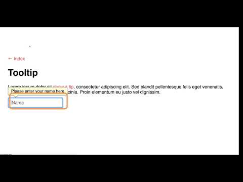
Watch the following video to see how ChromeVox interacts with a tooltip. The Tab key is used to navigate to the first tooltip, which opens a live region when its content is read aloud. Pressing the Tab key once again, move focus to the text input field, and a second tooltip opens and its content is read aloud. Aim to have the tooltips you update in Activity 6 on the following page operate and announce like the one in the video.
Video: Accessible Tooltips


