11.1: Pros and Cons of PowerPoint
- Page ID
- 4482
\( \newcommand{\vecs}[1]{\overset { \scriptstyle \rightharpoonup} {\mathbf{#1}} } \)
\( \newcommand{\vecd}[1]{\overset{-\!-\!\rightharpoonup}{\vphantom{a}\smash {#1}}} \)
\( \newcommand{\id}{\mathrm{id}}\) \( \newcommand{\Span}{\mathrm{span}}\)
( \newcommand{\kernel}{\mathrm{null}\,}\) \( \newcommand{\range}{\mathrm{range}\,}\)
\( \newcommand{\RealPart}{\mathrm{Re}}\) \( \newcommand{\ImaginaryPart}{\mathrm{Im}}\)
\( \newcommand{\Argument}{\mathrm{Arg}}\) \( \newcommand{\norm}[1]{\| #1 \|}\)
\( \newcommand{\inner}[2]{\langle #1, #2 \rangle}\)
\( \newcommand{\Span}{\mathrm{span}}\)
\( \newcommand{\id}{\mathrm{id}}\)
\( \newcommand{\Span}{\mathrm{span}}\)
\( \newcommand{\kernel}{\mathrm{null}\,}\)
\( \newcommand{\range}{\mathrm{range}\,}\)
\( \newcommand{\RealPart}{\mathrm{Re}}\)
\( \newcommand{\ImaginaryPart}{\mathrm{Im}}\)
\( \newcommand{\Argument}{\mathrm{Arg}}\)
\( \newcommand{\norm}[1]{\| #1 \|}\)
\( \newcommand{\inner}[2]{\langle #1, #2 \rangle}\)
\( \newcommand{\Span}{\mathrm{span}}\) \( \newcommand{\AA}{\unicode[.8,0]{x212B}}\)
\( \newcommand{\vectorA}[1]{\vec{#1}} % arrow\)
\( \newcommand{\vectorAt}[1]{\vec{\text{#1}}} % arrow\)
\( \newcommand{\vectorB}[1]{\overset { \scriptstyle \rightharpoonup} {\mathbf{#1}} } \)
\( \newcommand{\vectorC}[1]{\textbf{#1}} \)
\( \newcommand{\vectorD}[1]{\overrightarrow{#1}} \)
\( \newcommand{\vectorDt}[1]{\overrightarrow{\text{#1}}} \)
\( \newcommand{\vectE}[1]{\overset{-\!-\!\rightharpoonup}{\vphantom{a}\smash{\mathbf {#1}}}} \)
\( \newcommand{\vecs}[1]{\overset { \scriptstyle \rightharpoonup} {\mathbf{#1}} } \)
\( \newcommand{\vecd}[1]{\overset{-\!-\!\rightharpoonup}{\vphantom{a}\smash {#1}}} \)
\(\newcommand{\avec}{\mathbf a}\) \(\newcommand{\bvec}{\mathbf b}\) \(\newcommand{\cvec}{\mathbf c}\) \(\newcommand{\dvec}{\mathbf d}\) \(\newcommand{\dtil}{\widetilde{\mathbf d}}\) \(\newcommand{\evec}{\mathbf e}\) \(\newcommand{\fvec}{\mathbf f}\) \(\newcommand{\nvec}{\mathbf n}\) \(\newcommand{\pvec}{\mathbf p}\) \(\newcommand{\qvec}{\mathbf q}\) \(\newcommand{\svec}{\mathbf s}\) \(\newcommand{\tvec}{\mathbf t}\) \(\newcommand{\uvec}{\mathbf u}\) \(\newcommand{\vvec}{\mathbf v}\) \(\newcommand{\wvec}{\mathbf w}\) \(\newcommand{\xvec}{\mathbf x}\) \(\newcommand{\yvec}{\mathbf y}\) \(\newcommand{\zvec}{\mathbf z}\) \(\newcommand{\rvec}{\mathbf r}\) \(\newcommand{\mvec}{\mathbf m}\) \(\newcommand{\zerovec}{\mathbf 0}\) \(\newcommand{\onevec}{\mathbf 1}\) \(\newcommand{\real}{\mathbb R}\) \(\newcommand{\twovec}[2]{\left[\begin{array}{r}#1 \\ #2 \end{array}\right]}\) \(\newcommand{\ctwovec}[2]{\left[\begin{array}{c}#1 \\ #2 \end{array}\right]}\) \(\newcommand{\threevec}[3]{\left[\begin{array}{r}#1 \\ #2 \\ #3 \end{array}\right]}\) \(\newcommand{\cthreevec}[3]{\left[\begin{array}{c}#1 \\ #2 \\ #3 \end{array}\right]}\) \(\newcommand{\fourvec}[4]{\left[\begin{array}{r}#1 \\ #2 \\ #3 \\ #4 \end{array}\right]}\) \(\newcommand{\cfourvec}[4]{\left[\begin{array}{c}#1 \\ #2 \\ #3 \\ #4 \end{array}\right]}\) \(\newcommand{\fivevec}[5]{\left[\begin{array}{r}#1 \\ #2 \\ #3 \\ #4 \\ #5 \\ \end{array}\right]}\) \(\newcommand{\cfivevec}[5]{\left[\begin{array}{c}#1 \\ #2 \\ #3 \\ #4 \\ #5 \\ \end{array}\right]}\) \(\newcommand{\mattwo}[4]{\left[\begin{array}{rr}#1 \amp #2 \\ #3 \amp #4 \\ \end{array}\right]}\) \(\newcommand{\laspan}[1]{\text{Span}\{#1\}}\) \(\newcommand{\bcal}{\cal B}\) \(\newcommand{\ccal}{\cal C}\) \(\newcommand{\scal}{\cal S}\) \(\newcommand{\wcal}{\cal W}\) \(\newcommand{\ecal}{\cal E}\) \(\newcommand{\coords}[2]{\left\{#1\right\}_{#2}}\) \(\newcommand{\gray}[1]{\color{gray}{#1}}\) \(\newcommand{\lgray}[1]{\color{lightgray}{#1}}\) \(\newcommand{\rank}{\operatorname{rank}}\) \(\newcommand{\row}{\text{Row}}\) \(\newcommand{\col}{\text{Col}}\) \(\renewcommand{\row}{\text{Row}}\) \(\newcommand{\nul}{\text{Nul}}\) \(\newcommand{\var}{\text{Var}}\) \(\newcommand{\corr}{\text{corr}}\) \(\newcommand{\len}[1]{\left|#1\right|}\) \(\newcommand{\bbar}{\overline{\bvec}}\) \(\newcommand{\bhat}{\widehat{\bvec}}\) \(\newcommand{\bperp}{\bvec^\perp}\) \(\newcommand{\xhat}{\widehat{\xvec}}\) \(\newcommand{\vhat}{\widehat{\vvec}}\) \(\newcommand{\uhat}{\widehat{\uvec}}\) \(\newcommand{\what}{\widehat{\wvec}}\) \(\newcommand{\Sighat}{\widehat{\Sigma}}\) \(\newcommand{\lt}{<}\) \(\newcommand{\gt}{>}\) \(\newcommand{\amp}{&}\) \(\definecolor{fillinmathshade}{gray}{0.9}\)Learning Objectives
- Present evidence for your conclusions
- Determine when to use PowerPoint as a report writer rather than a presentation tool
- Describe the conditions under which PowerPoint fails to communicate well
Introduction
When applying for a business loan or seeking investors, you will have to present your project. You are likely to fare better if you follow accepted standards of business presentations. One of those standards is the schematic report.
You are probably already familiar with the use of PowerPoint to create presentations for an audience. Such presentations will be covered in more detail in the next chapter. However, in this chapter we look at PowerPoint as a report generation tool.
In business, PowerPoint has been gaining traction as a page layout tool to generate reports. These reports use smaller fonts, mix text and graphics, and are designed primarily to be read rather than projected on the screen. Businesses use different names for this type of report including decks, reading decks, and schematic reports.
Used in this way, PowerPoint becomes equivalent to a poor man’s desktop publishing package—but with the added advantage that the report also fits neatly on the screen.
However, it is difficult for an audience to read a font smaller than 24 point onscreen. Small font presentations (around 11 point) raise the obvious question as to why the presentation should be projected at all.
Where Are We in the Life Cycle?
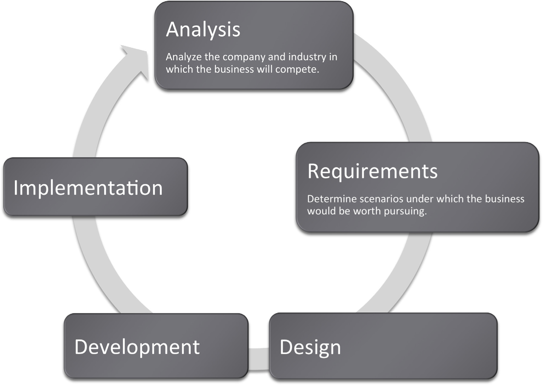
Many information systems projects are conceived of in a life cycle that progresses in stages from analysis to implementation. The diagram below shows the stages that we touch in the current chapter:
Focus on Evidence
Rarely can you prove anything in business. The best you can do is give evidence for your position. Your audience will decide whether your evidence is compelling. And if it is not compelling, well then you have learned something for next time.
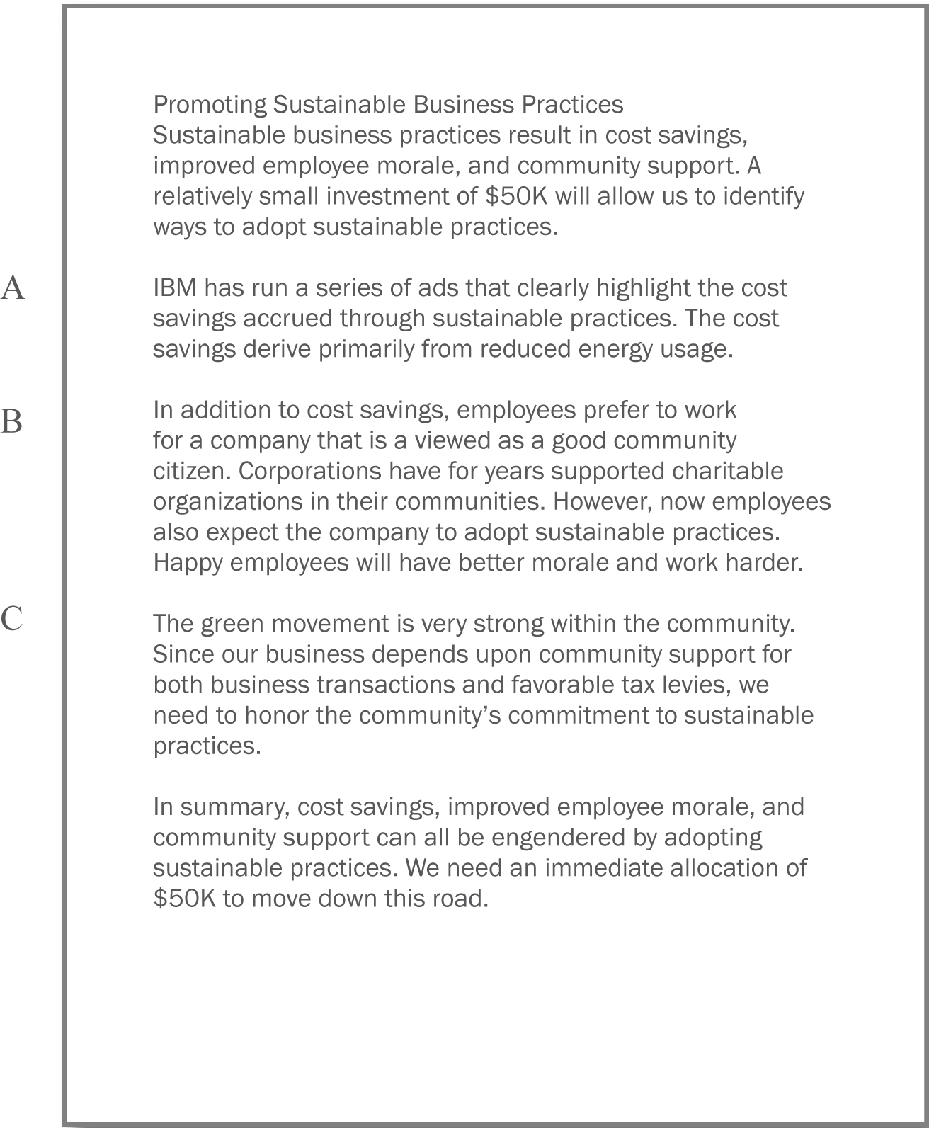
In most business presentations, you will need to get across information that inspires your audience to take action. Design is not a substitute for good content, but the combination of the two produces excellent results. The table below demonstrates a method of critical thinking. The method shows how to organize an argument in order to support a claim. Note that every point is supported by hard evidence. This format can be used both in papers and presentations:
|
Paragraph |
Thought Process |
Sample Words |
|---|---|---|
|
Claim or thesis |
Here’s what I believe based on points A, B, and C. |
I believe we should allocate$50K to investigate sustainable business practices because of cost savings, employee morale, and community support. |
|
Evidence of A: examples and credible sources |
Here’s why I believe A. |
Cost savings through reduced energy usage. |
|
Evidence for B: examples and credible sources |
Here’s why I believe B. |
Improved employee morale by working for socially responsible company. |
|
Evidence for C: examples and credible sources |
Here’s why I believe C. |
Community support for green practices. |
|
Summary |
As I have shown, my belief _____ is reinforced by points A, B, and C. |
In summary, cost savings, employee morale, and community support, encourages allocation of $50K to investigate sustainable business practices. |
PowerPoint as a Report Writer
Traditionally students are taught to write reports using a word processor such as Microsoft Word. The emphasis in the reports is on grammar and composition. However, much of corporate America has been moving in a different direction. The primary means of formal communication in corporations is with PowerPoint.
PowerPoint was developed as a presentation graphics package. PowerPoint presentations are designed to supplement a live presenter. For this reason, the fonts used tend to be large (around 24 point) and the words few (less than fifty per page) so that the audience can read them. The bullet points also serve as a cue for the presenter in lieu of note cards.
To put this in perspective, a single page of a word processed document could have 500 words or ten times as many words as a slide. The words would be set using a smaller font—usually 10 or 11 point.
With relatively few words to express oneself, every word should be carefully chosen. Unfortunately, very often we see the opposite—presentations hastily assembled at the last minute.
However, there is a growing movement to create presentations that can stand with or without the presenter. This requires using smaller fonts and adding far more text. The small text creates a presentation that can no longer be read easily by the audience. What should be a presentation turns into an eye test. To compensate, many times audience members are each provided with a copy of the presentation. So while they may not be able to read the screen, they can follow along.
Hopefully the copy provided to the audience contains one slide per page. Unfortunately, sometimes in an effort to save paper, the presenter will use a PowerPoint handout with three slides per page and a space for the audience to write notes. This simply transfers the eye test to paper.
The term used in corporate America to describe a PowerPoint presentation is a deck. The term has obvious ties to a deck of cards. And like a deck of cards, one can easily reorganize a deck to customize the presentation for a new audience. The term deck is used whether the slides are primarily designed for a presentation or primarily designed to be read. However, to be clear about which we mean, we will use the term schematic report to describe a deck intended to be read rather than projected.
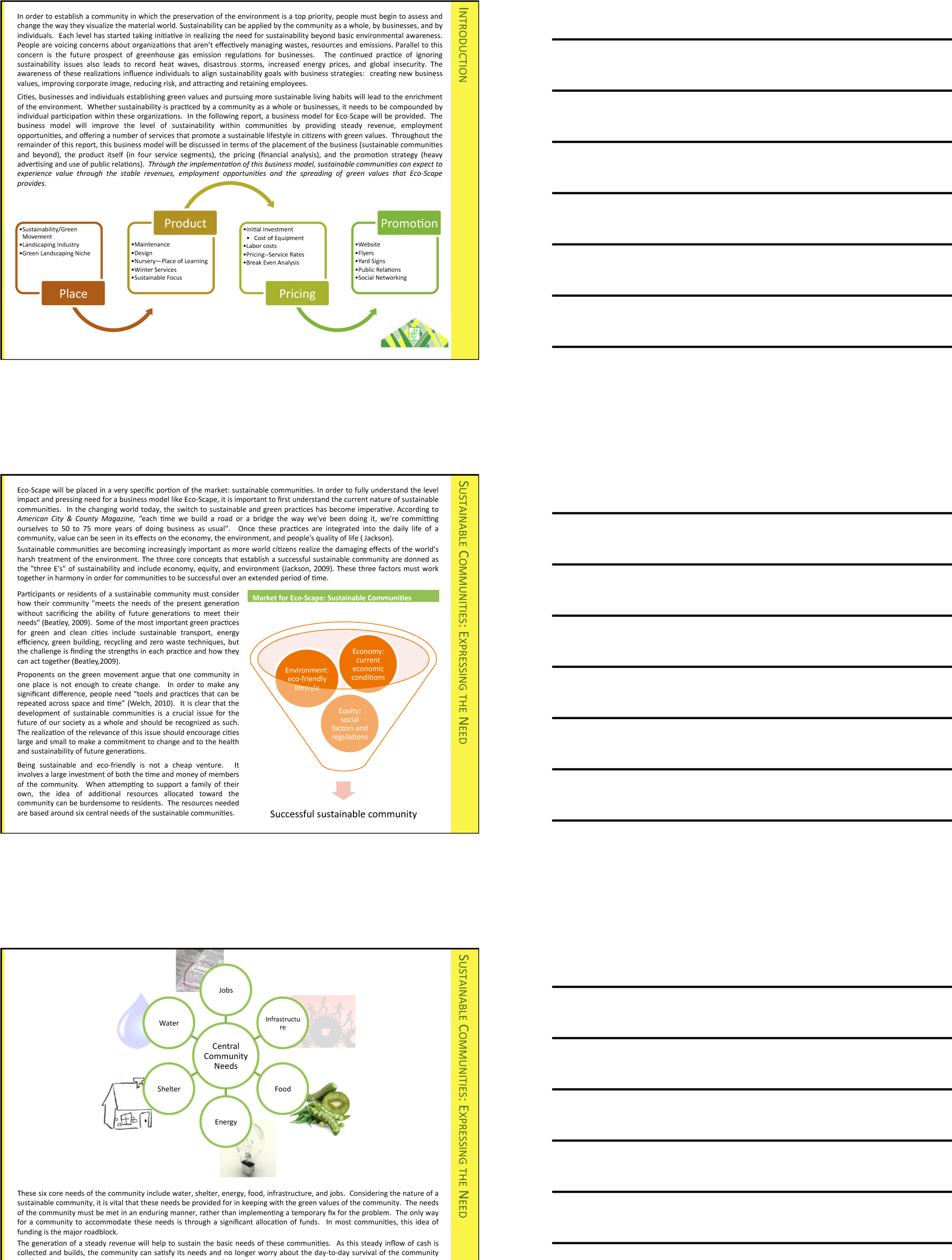
Distributing handouts to the audience is only helpful if the slides are readable. Here they are not, nor would they be readable projected on the screen. The only way to make this presentation readable is to print one slide per page.
How to Overcome the Cons
PowerPoint has four advantages over Word. First, it does help keep everyone on the same “page.” A PowerPoint “page” fits conveniently on one screen—a Word page would not. Second, PowerPoint allows for easy integration of text and graphics. Text boxes and images stay put and resize intuitively without creating awkward page breaks. You can similarly integrate text and images in Word—but it is less intuitive. Third, PowerPoint themes allow the presentation to take on a slick and unified look, almost like a brochure. Each theme has a number of layouts associated with it so that each slide can be structured to accommodate the material for that slide while still having the same look as the rest of the presentation. Fourth, because each slide tends to encapsulate a complete idea, it is fairly easy to reorganize the deck to customize it for a new audience. There is even a slide sorter view to help with this task.
PowerPoint also has some disadvantages as a report writer, as compared with Word. First, without text flow the presenter is tempted to fit each idea, no matter how complex, onto a single slide. Lack of text flow can lead to over abbreviation of complex concepts—sometimes with disastrous results. Second, PowerPoint resizes text automatically to fit on the slide. As you add words to a slide, the font shrinks in size so that all the text will fit. If the subsequent slide has fewer words, the text will be larger; if it has more words, the text will be smaller. Auto text resize leads to awkward differences in text size among slides—which does not look professional.
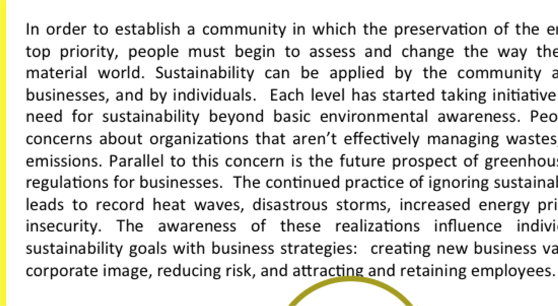
To expand on the text resize point a little bit more, consider that memos and other office documents are normally set in around 11 point type. PowerPoint slides usually opt for at least 24 point type. The no man’s land between 11 point and 24 point might be around 16 to 18 point. This looks like the font of a children’s book, which is not professional. The example below shows the body text at both 12 point and 18 point.
Both PowerPoint disadvantages—auto text resize, and one idea per slide—can be overcome. Some PowerPoint templates, such as Pitchbook, suppress text resize. With the font locked at 11 point, the writer can avoid a no man’s land 16 or 18 point font. Overcoming the text flow problem is harder. Our recommendation is that the writer create all content in Microsoft Word and then flow the content into PowerPoint. In fact that is how we created the slides below.
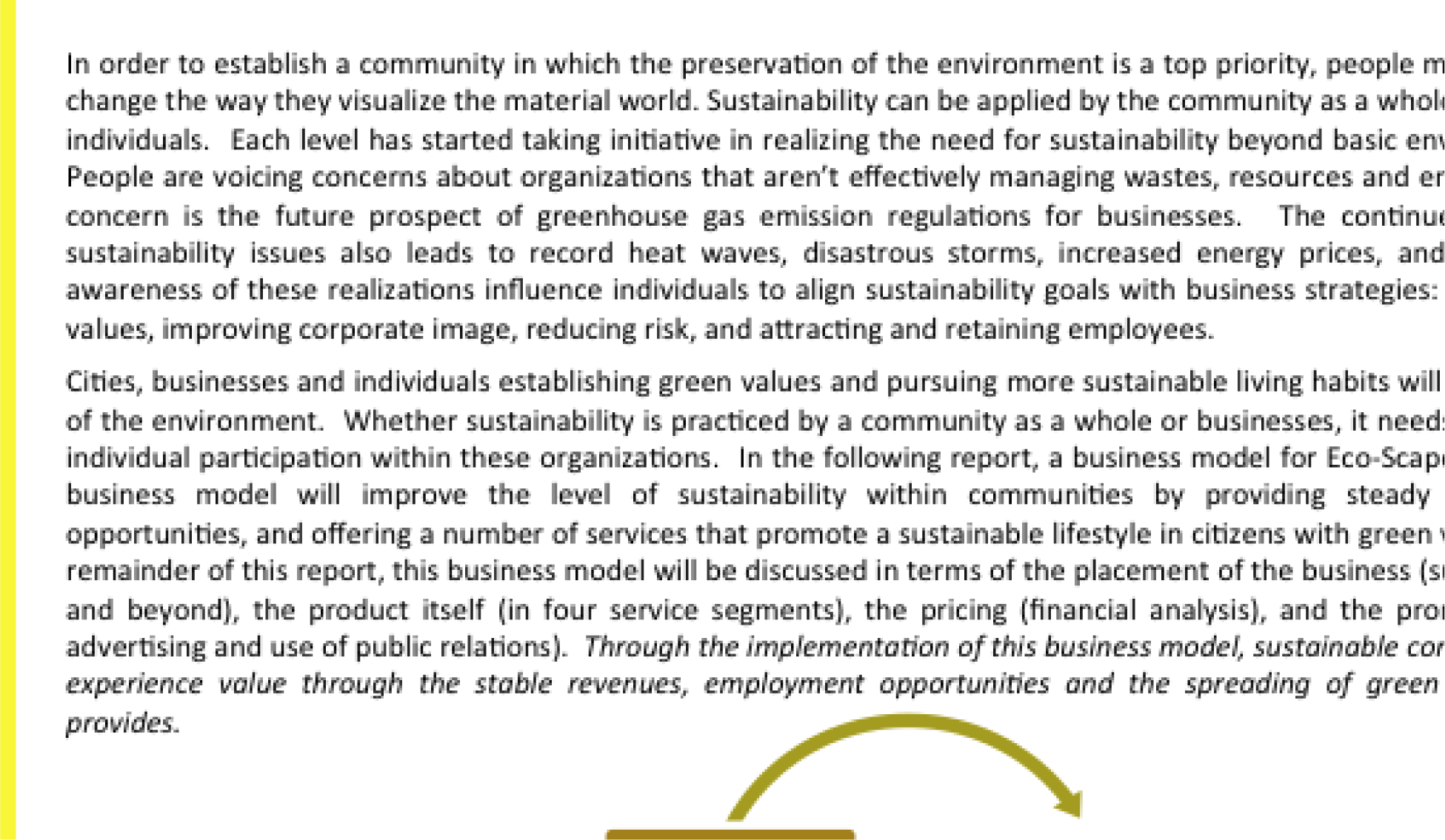
11 point (above) is good for a written report. 16 point (following) looks like the font in a children’s book.
Does PowerPoint Corrupt Us?
There is a third, more controversial, disadvantage of PowerPoint. Edward Tufte argues that PowerPoint encourages the pitching of ideas rather than dispassionate reflection. He cautions that when we pitch out, we corrupt within. In other words, if we tend to use a medium designed to sell ideas, rather than discuss them, we might lose our own objectivity to the detriment of our message—and our organization. Certainly there is some evidence for Tufte’s position. A quick look at the built in PowerPoint templates, reveals a decidedly marketing orientation. For example, there is a built in Pitchbook template, but there does not appear to be a built in “weigh all angles” template.
Tufte terms the tendency to market and simplify ideas the cognitive style of PowerPoint. He is especially troubled by the use of bullets rather than complete sentences and paragraphs to convey information. Such presentations he argues should not circulate alone as though they are documents. He provides a compelling example of the dangers of PowerPoint reports with the Columbia Space Shuttle disaster. On February 1, 2003, the Columbia Space Shuttle disintegrated and burned up on reentry, when its heat shield was compromised by a foam hit 16 days earlier. The official presidential report faulted the way that the potential danger had been poorly communicated by Boeing using bulleted lists rather than paragraphs and complete sentences.
Tufte goes on further to claim that for on screen presentations, PowerPoint should only be used as a slide projector to project images. Words should be supplied by the speaker. There is some truth to the slide projector position as we shall see in the next section.
Having said that, however, perhaps Tufte’s remarks should be taken as a caution, rather than a condemnation of the PowerPoint medium. Having fewer words makes it more challenging to communicate, but does not preclude effective communication.
Columbia Disaster
On February 1, 2003, the Space Shuttle Columbia disintegrated upon re-entry to the earth’s atmosphere. All seven astronauts on board perished. The cause of the accident was a piece of hard foam insulation the size of a small briefcase and about the same weight as a basketball, which broke off the external fuel tank, slamming into the wing at 500 miles per hour during liftoff sixteen days earlier. The impact would be the equivalent of a 100 pound weight dropped from 200 feet in the air.
NASA knew about the foam hit the day after liftoff. They asked the fuel tank manufacturer, Boeing, to analyze the foam hit. Boeing developed a computer program called Crater to analyze the effects of foam hits. The program was calibrated using the history of foam hits on previous flights. To be safe, Crater was programmed to over predict damage. As it happens, foam hits on prior launches were a regular occurrence. However, most of the foam pieces were tiny and put only minor chinks in the ceramic heat shield tiles. However, this piece of foam was much bigger. Nonetheless, NASA’s reading of the report back from Boeing was that there was no danger to Columbia. They took no further action.
Unfortunately, the report back from Boeing took the form of a poorly designed PowerPoint deck. Edward Tufte presents a compelling case that one of the contributing factors in the Columbia Space Shuttle accident was this deck. The key slide from that deck appears on the following page. Tufte argues that PowerPoint encourages the type of sloppy writing that appears on the key slide. As you read the “Before” slide, it will appear that there is very little danger to Columbia. The title of the slide, “Review of Test Date Indicates Conservatism for Tile Penetration,” gives a false sense of reassurance. In fact, they are talking about the Crater program being conservative, not the projected damage to Columbia. Tufte feels that an author writing in complete sentences and paragraphs in a report would be less likely to be misunderstood. Maybe.
However, we would argue that the real culprit is bad writing. Bad writing is bad writing whatever the medium of expression. To us, it appears that the authors of the slide were trying to sell the virtues of the Crater program rather than acknowledge its limitations. Selling has a place at the beginning of a presentation to engage the audience interest. However, selling should never be mixed with content.
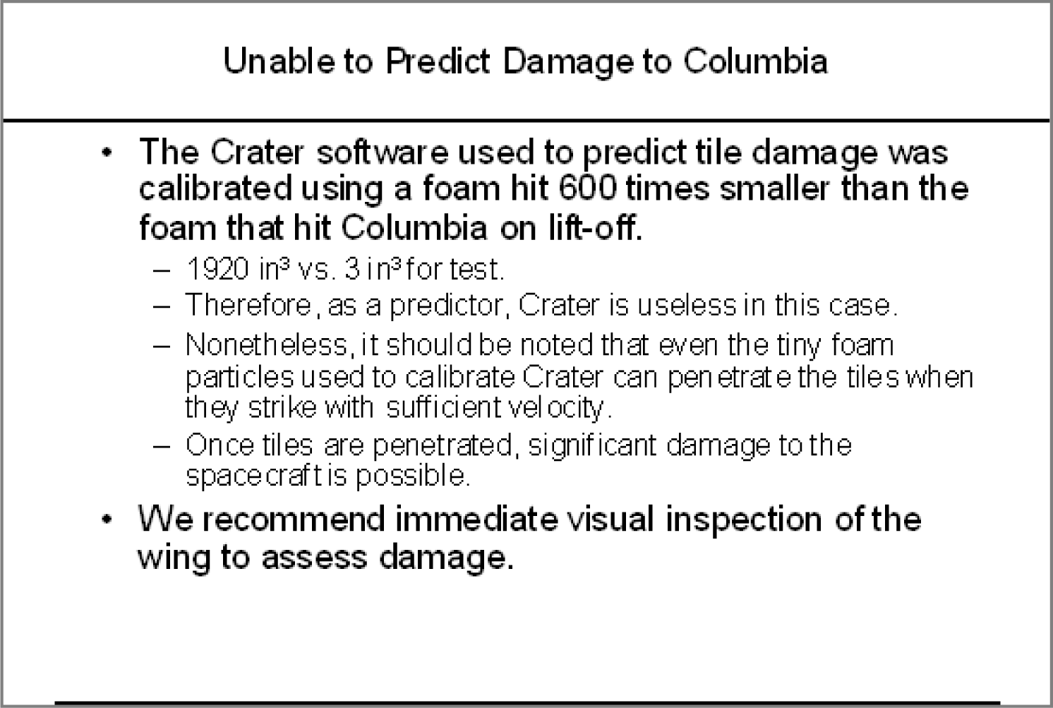
To make our point, we rewrote the key slide to remove the selling, express clearly what it really provides evidence for, and what it should have concluded. We believe that our rewrite would not have been similarly misunderstood.Tufte, Edward, The Cognitive Style of PowerPoint, Graphics Press, May 2003.
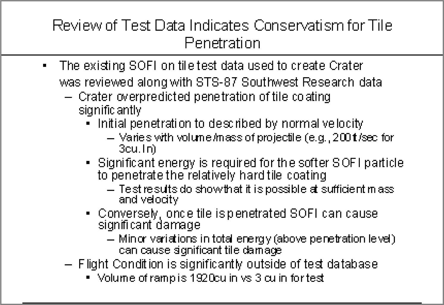
The original Boeing slide (above) and the authors’ rewrite to clarify the material below. Lead off with your conclusion and then give evidence.
Key Takeaways
- Reports should use a font size around 11 point.
- Disadvantages of PowerPoint include oversimplification of ideas, inconsistent font sizes, and a tendency to pitch rather than discuss ideas.
Questions and Exercises
- Does the abbreviated style of PowerPoint require even better writing? Explain.


