
12.1: Designing Presentations
- Page ID
- 4489
\( \newcommand{\vecs}[1]{\overset { \scriptstyle \rightharpoonup} {\mathbf{#1}} } \)
\( \newcommand{\vecd}[1]{\overset{-\!-\!\rightharpoonup}{\vphantom{a}\smash {#1}}} \)
\( \newcommand{\id}{\mathrm{id}}\) \( \newcommand{\Span}{\mathrm{span}}\)
( \newcommand{\kernel}{\mathrm{null}\,}\) \( \newcommand{\range}{\mathrm{range}\,}\)
\( \newcommand{\RealPart}{\mathrm{Re}}\) \( \newcommand{\ImaginaryPart}{\mathrm{Im}}\)
\( \newcommand{\Argument}{\mathrm{Arg}}\) \( \newcommand{\norm}[1]{\| #1 \|}\)
\( \newcommand{\inner}[2]{\langle #1, #2 \rangle}\)
\( \newcommand{\Span}{\mathrm{span}}\)
\( \newcommand{\id}{\mathrm{id}}\)
\( \newcommand{\Span}{\mathrm{span}}\)
\( \newcommand{\kernel}{\mathrm{null}\,}\)
\( \newcommand{\range}{\mathrm{range}\,}\)
\( \newcommand{\RealPart}{\mathrm{Re}}\)
\( \newcommand{\ImaginaryPart}{\mathrm{Im}}\)
\( \newcommand{\Argument}{\mathrm{Arg}}\)
\( \newcommand{\norm}[1]{\| #1 \|}\)
\( \newcommand{\inner}[2]{\langle #1, #2 \rangle}\)
\( \newcommand{\Span}{\mathrm{span}}\) \( \newcommand{\AA}{\unicode[.8,0]{x212B}}\)
\( \newcommand{\vectorA}[1]{\vec{#1}} % arrow\)
\( \newcommand{\vectorAt}[1]{\vec{\text{#1}}} % arrow\)
\( \newcommand{\vectorB}[1]{\overset { \scriptstyle \rightharpoonup} {\mathbf{#1}} } \)
\( \newcommand{\vectorC}[1]{\textbf{#1}} \)
\( \newcommand{\vectorD}[1]{\overrightarrow{#1}} \)
\( \newcommand{\vectorDt}[1]{\overrightarrow{\text{#1}}} \)
\( \newcommand{\vectE}[1]{\overset{-\!-\!\rightharpoonup}{\vphantom{a}\smash{\mathbf {#1}}}} \)
\( \newcommand{\vecs}[1]{\overset { \scriptstyle \rightharpoonup} {\mathbf{#1}} } \)
\( \newcommand{\vecd}[1]{\overset{-\!-\!\rightharpoonup}{\vphantom{a}\smash {#1}}} \)
\(\newcommand{\avec}{\mathbf a}\) \(\newcommand{\bvec}{\mathbf b}\) \(\newcommand{\cvec}{\mathbf c}\) \(\newcommand{\dvec}{\mathbf d}\) \(\newcommand{\dtil}{\widetilde{\mathbf d}}\) \(\newcommand{\evec}{\mathbf e}\) \(\newcommand{\fvec}{\mathbf f}\) \(\newcommand{\nvec}{\mathbf n}\) \(\newcommand{\pvec}{\mathbf p}\) \(\newcommand{\qvec}{\mathbf q}\) \(\newcommand{\svec}{\mathbf s}\) \(\newcommand{\tvec}{\mathbf t}\) \(\newcommand{\uvec}{\mathbf u}\) \(\newcommand{\vvec}{\mathbf v}\) \(\newcommand{\wvec}{\mathbf w}\) \(\newcommand{\xvec}{\mathbf x}\) \(\newcommand{\yvec}{\mathbf y}\) \(\newcommand{\zvec}{\mathbf z}\) \(\newcommand{\rvec}{\mathbf r}\) \(\newcommand{\mvec}{\mathbf m}\) \(\newcommand{\zerovec}{\mathbf 0}\) \(\newcommand{\onevec}{\mathbf 1}\) \(\newcommand{\real}{\mathbb R}\) \(\newcommand{\twovec}[2]{\left[\begin{array}{r}#1 \\ #2 \end{array}\right]}\) \(\newcommand{\ctwovec}[2]{\left[\begin{array}{c}#1 \\ #2 \end{array}\right]}\) \(\newcommand{\threevec}[3]{\left[\begin{array}{r}#1 \\ #2 \\ #3 \end{array}\right]}\) \(\newcommand{\cthreevec}[3]{\left[\begin{array}{c}#1 \\ #2 \\ #3 \end{array}\right]}\) \(\newcommand{\fourvec}[4]{\left[\begin{array}{r}#1 \\ #2 \\ #3 \\ #4 \end{array}\right]}\) \(\newcommand{\cfourvec}[4]{\left[\begin{array}{c}#1 \\ #2 \\ #3 \\ #4 \end{array}\right]}\) \(\newcommand{\fivevec}[5]{\left[\begin{array}{r}#1 \\ #2 \\ #3 \\ #4 \\ #5 \\ \end{array}\right]}\) \(\newcommand{\cfivevec}[5]{\left[\begin{array}{c}#1 \\ #2 \\ #3 \\ #4 \\ #5 \\ \end{array}\right]}\) \(\newcommand{\mattwo}[4]{\left[\begin{array}{rr}#1 \amp #2 \\ #3 \amp #4 \\ \end{array}\right]}\) \(\newcommand{\laspan}[1]{\text{Span}\{#1\}}\) \(\newcommand{\bcal}{\cal B}\) \(\newcommand{\ccal}{\cal C}\) \(\newcommand{\scal}{\cal S}\) \(\newcommand{\wcal}{\cal W}\) \(\newcommand{\ecal}{\cal E}\) \(\newcommand{\coords}[2]{\left\{#1\right\}_{#2}}\) \(\newcommand{\gray}[1]{\color{gray}{#1}}\) \(\newcommand{\lgray}[1]{\color{lightgray}{#1}}\) \(\newcommand{\rank}{\operatorname{rank}}\) \(\newcommand{\row}{\text{Row}}\) \(\newcommand{\col}{\text{Col}}\) \(\renewcommand{\row}{\text{Row}}\) \(\newcommand{\nul}{\text{Nul}}\) \(\newcommand{\var}{\text{Var}}\) \(\newcommand{\corr}{\text{corr}}\) \(\newcommand{\len}[1]{\left|#1\right|}\) \(\newcommand{\bbar}{\overline{\bvec}}\) \(\newcommand{\bhat}{\widehat{\bvec}}\) \(\newcommand{\bperp}{\bvec^\perp}\) \(\newcommand{\xhat}{\widehat{\xvec}}\) \(\newcommand{\vhat}{\widehat{\vvec}}\) \(\newcommand{\uhat}{\widehat{\uvec}}\) \(\newcommand{\what}{\widehat{\wvec}}\) \(\newcommand{\Sighat}{\widehat{\Sigma}}\) \(\newcommand{\lt}{<}\) \(\newcommand{\gt}{>}\) \(\newcommand{\amp}{&}\) \(\definecolor{fillinmathshade}{gray}{0.9}\)Learning Objectives
- Design a memorable PowerPoint presentation
- Manipulate images and text to create a compelling business case presentation
- Accurately characterize and use Presentation Zen principles
Introduction
PowerPoint presentations have become the standard method of presenting information in corporate America. This program is not only used in corporations; however, even professional sports teams and the military use PowerPoint to convey information internally.
Yet, there are still those who claim that PowerPoint is one of the least effective forms of communication for many reasons:
- Most presenters use slides with words only and yet very few words fit on a slide.
- Presenters tend to cram an entire idea—no matter how complex—onto a single slide.
- Most presentations are thrown together with limited preparation, and the goal of most presentations is to summarize and sell ideas rather than to engage the audience in serious discourse.
- Slides are only displayed one at a time. Therefore, the audience has the difficult task of trying to remember what information appeared on previous slides.
- Presenters tend to read their slides.
- Presenters tend to look at the screen when reading the slides thereby avoiding eye contact with the audience.
The result are presentations that are visually bland, intellectually insulting, and easily forgettable.
During your college career, you will use PowerPoint for almost every class in which you or a group has to do a presentation. In this chapter, you will learn how to make those presentations great. Presentations should explain material clearly and concisely while also prompting the audience to take a certain course of action.
A PowerPoint presentation should be a complement to your schematic report. In fact, you should be able to generate the PowerPoint presentation fairly quickly from your schematic report.
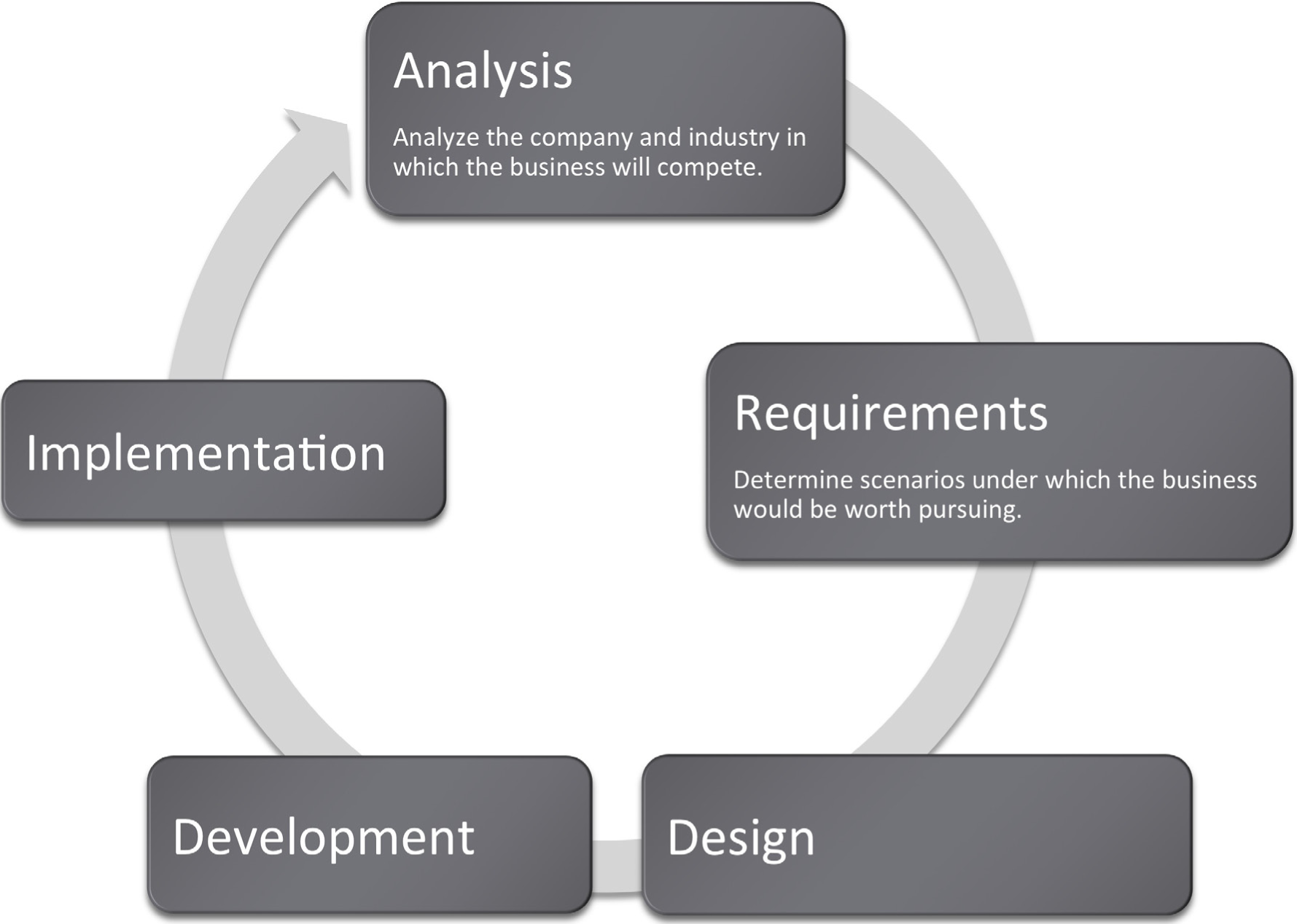
Where Are We in the Life Cycle?
Many information systems projects are conceived of in a life cycle that progresses in stages from analysis to implementation. The diagram below shows the stages that we touch in the current chapter:
Presentation Content
You need to determine the purpose of the presentation and possible circumstances or contexts in which the presentation might be given. This is a time to showcase your ideas and highlight all of the great things about your project. Be concise and powerful. This may be the most crucial deliverable of the project—especially if given to higher-ups who will have only skimmed the actual report.
Think of your presentation as an illustrated version of the executive summary of your schematic report. If you look at it that way, you have already done the work! Each idea from your executive summary should correspond to a slide. Pull ideas out of your executive summary and illustrate them with exhibits from inside the report. Each illustration should be accompanied by a sentence. The sentence can come from the executive summary or from the relevant slide in the report. You may even find that in the process, you end up revising and improving your executive summary.
Not every slide needs to be illustrated, and not every illustration needs to be included. A slide with a single sentence and no illustration may actually have great visual impact by contrast with the rest of the report. Furthermore, some of your illustrations may simply set up foundation knowledge or due diligence and need not make it to the presentation.
To finish up, create slides that bookend your presentation with an agenda up front and a summary at the end. Follow the old adage, tell them what you are going to tell them, then tell them, then tell them what you told them.
Here are some additional tips:
- Master the content. 90% of the words that come out of your mouth will not be on the slide. You want the audience to look at you not the slide. Furthermore, if you know your content, you can look at the audience. If necessary, have note cards that you could refer to in an emergency.
- Try to avoid handing out miniatures of your slides. Slides created using the method above will be virtually meaningless without the presenter. Hand out the schematic report or even just the executive summary instead.
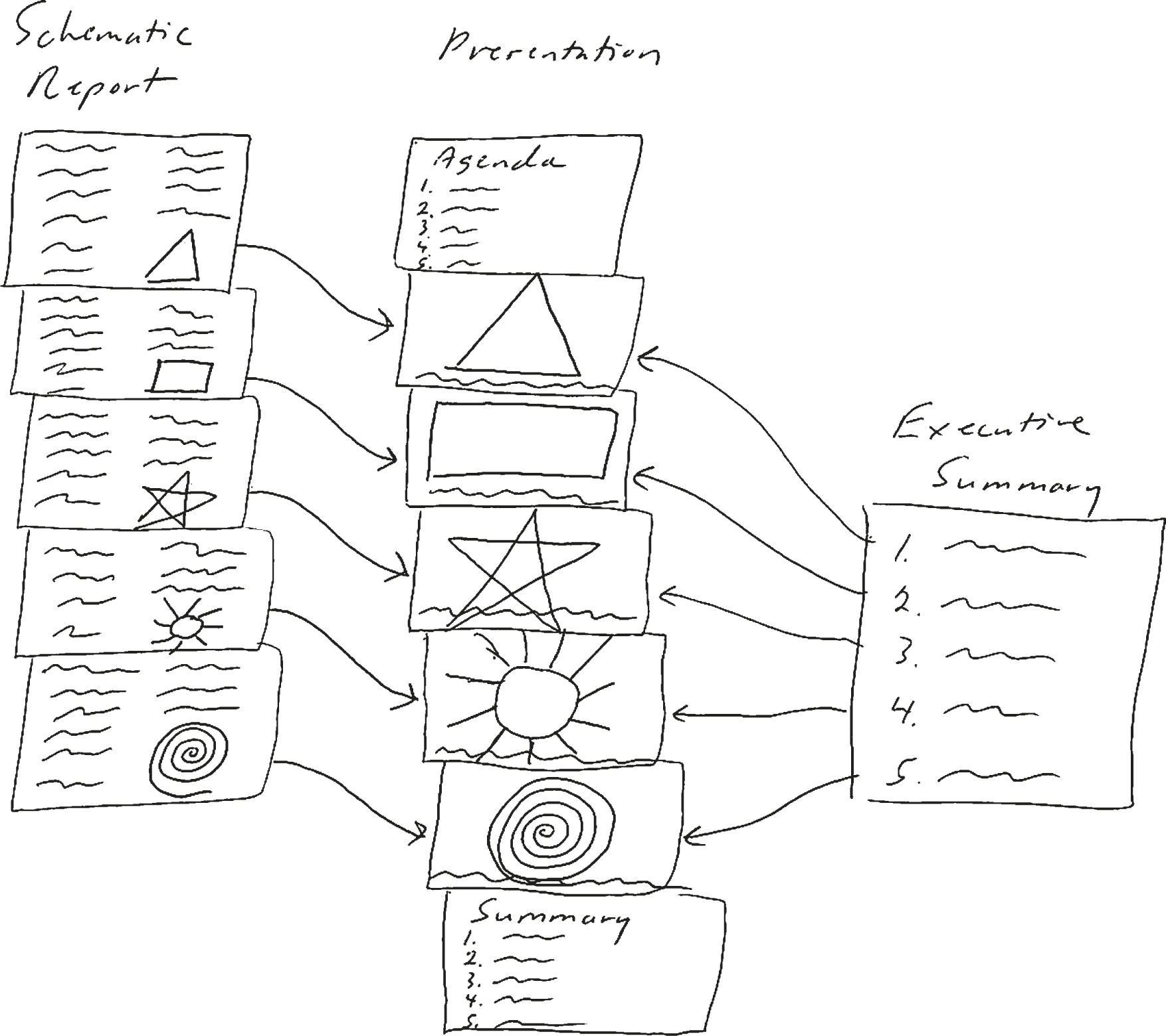
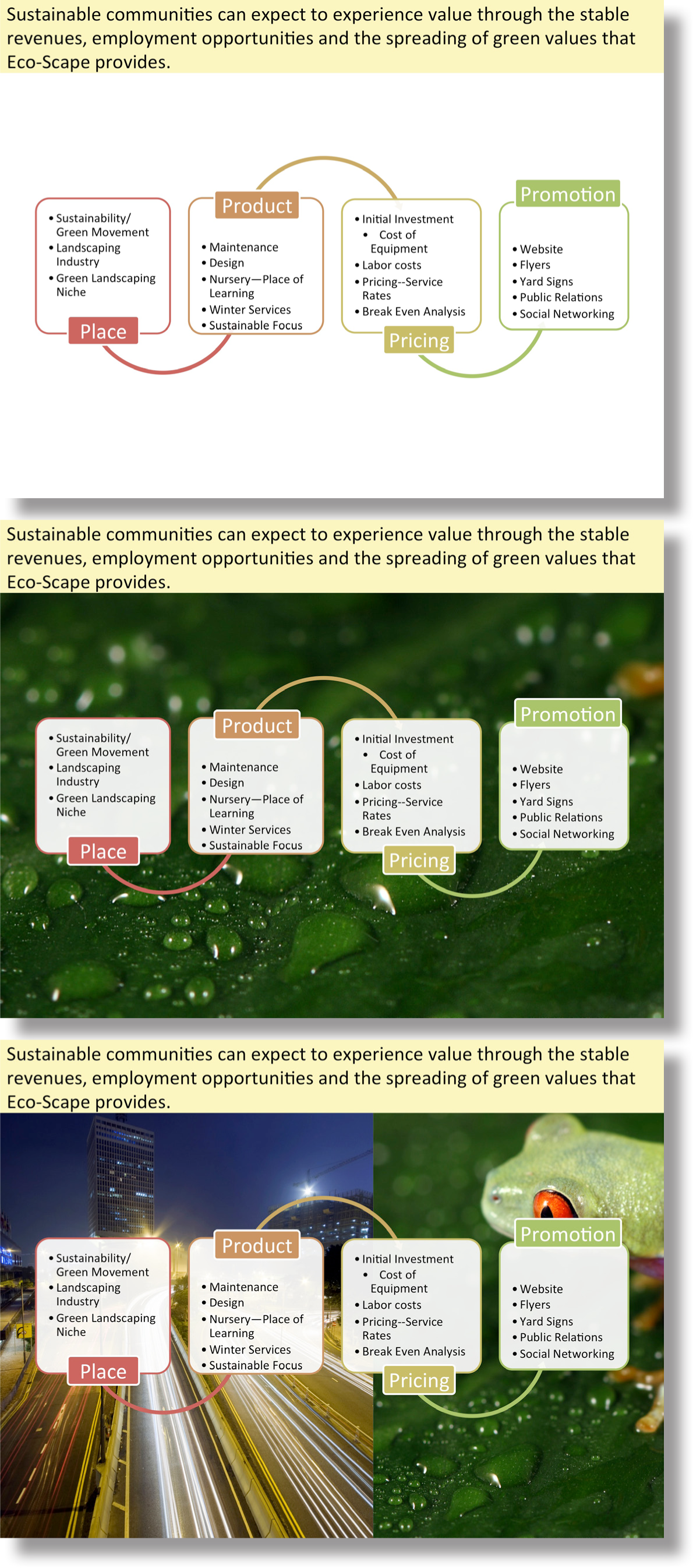
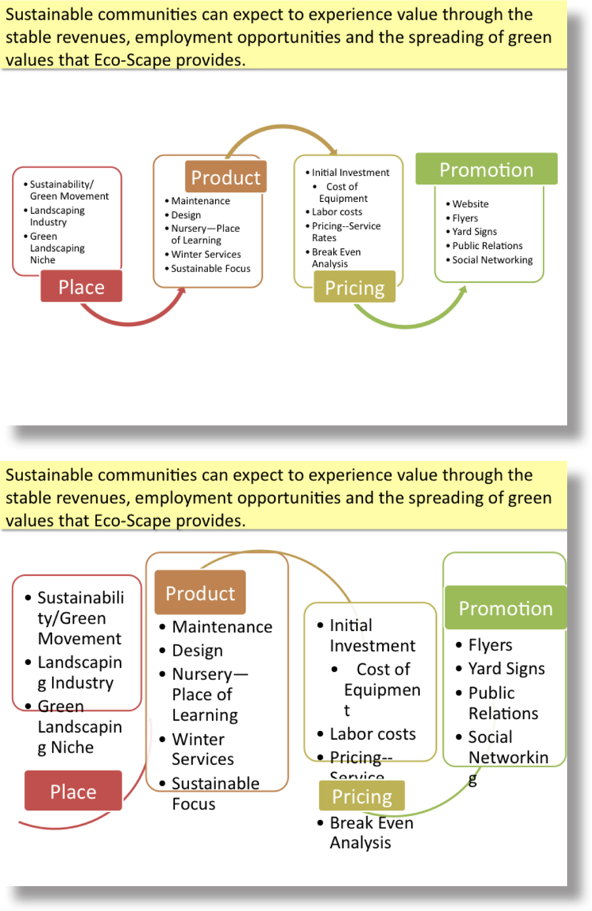
Depicting the process of moving from an executive summary to a PowerPoint presentation. Each sentence in your executive summary can form a slide heading (use your judgement). Then pull the images from your schematic report and enlarge them.
Slide Design - Themes
PowerPoint comes with many different themes to apply to your slides. In general, try to choose either a very light or a very dark colored background. Anything in between will wash out in a bright room.
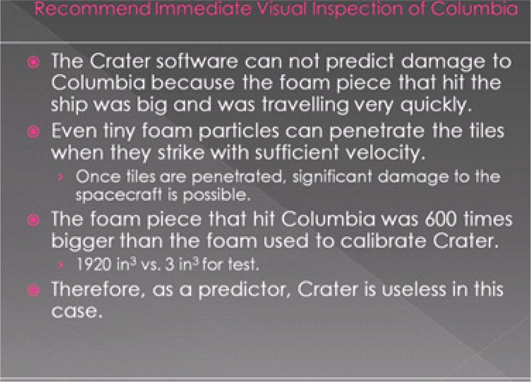
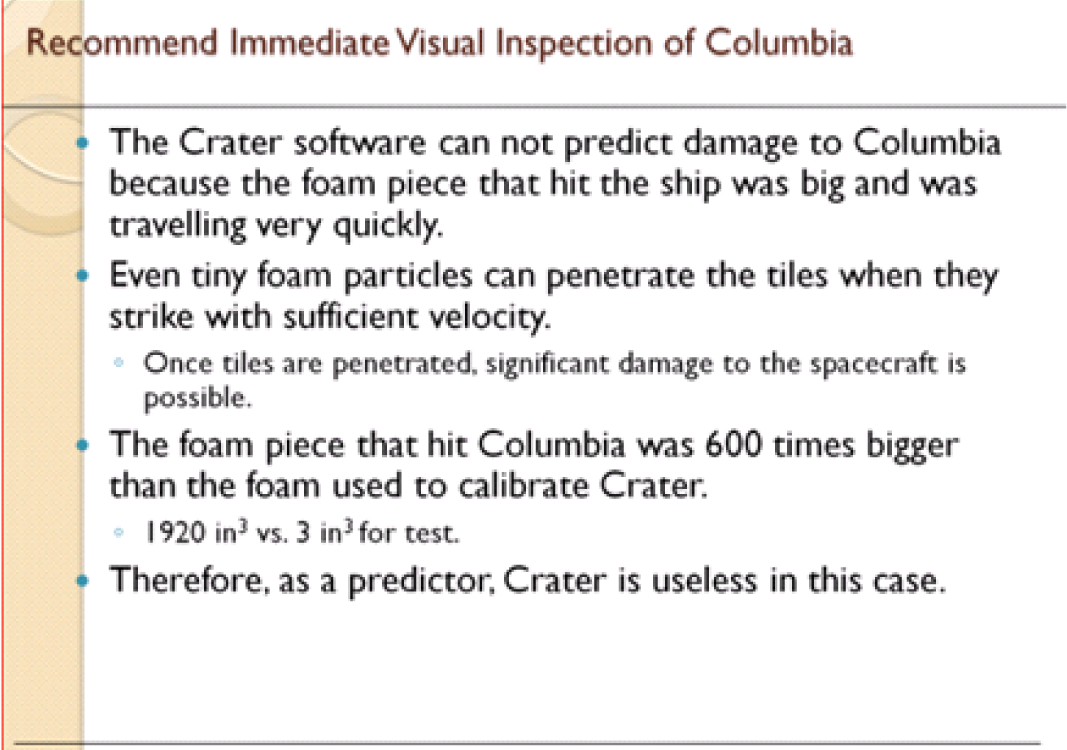
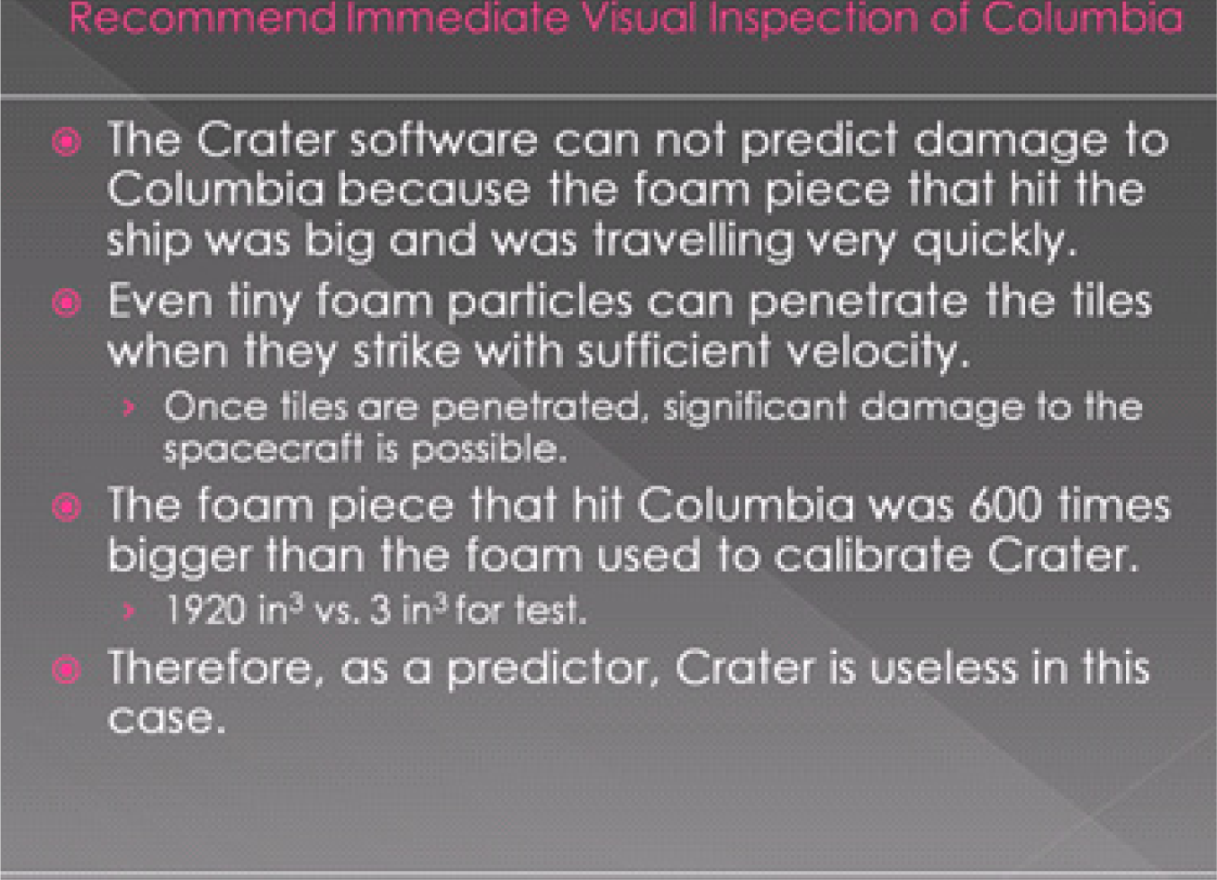
Themes cannot save a text heavy slide. It is still a boring slide and the speaker may feel obligated to read it to the audience. Many students turn to a dark background theme with the hope that it will convey more professionalism. However, as you can see, it doesn’t solve the problem of a boring slide.
A better option is to move most of the words to your schematic report and instead make your point in a dramatic visual fashion. Visual slides take much longer to create but could differentiate your presentation from every other boring PowerPoint presentation making yours more persuasive.
Slide Design - Principles
You want your presentation to be professional and engaging. To get there you will need the C.R.A.P. principles you have already learned. You will also need stylistic enhancements that come under the heading of Presentation Zen. Finally a little (and we do mean little) multimedia—embedded video or subtle use of animation serves to spice up a presentation.
The C.R.A.P. graphic design principles apply to slide design as well. Contrast, repetition, alignment, and proximity help organize information on your slide, focus attention, and create an overall professional look and feel.
Highly visual presentations with very few words are popularized by Garr Reynolds in his book, Presentation Zen. Reynolds advocates restraint, simplicity, and naturalness. The idea is that the slides naturally support your presentation rather than serving as a narrative. You are supposed to know your material.
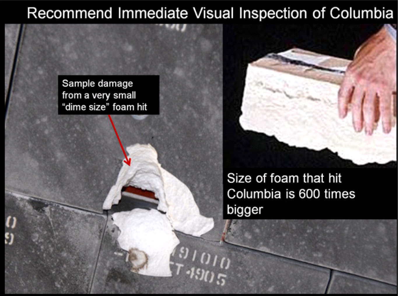
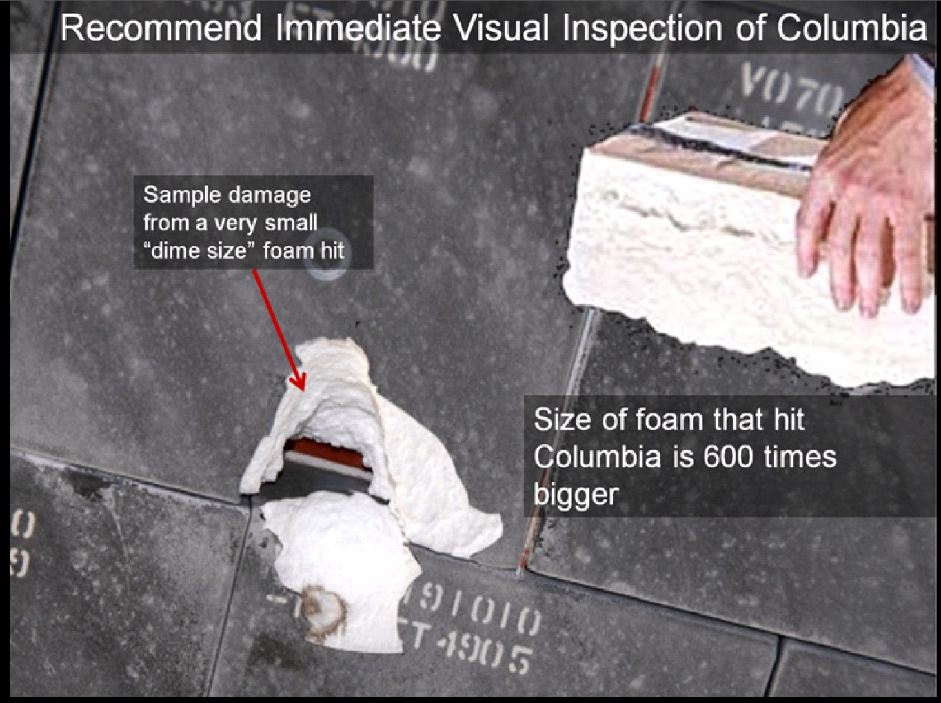
Presentation Zen slides are characterized by very large illustrations—often full page bleeds—and usually just one sentence of text. This is called the picture superiority effect—basically that pictures are more memorable than words.
Three other Presentation Zen principles are to aim for a high signal to noise ratio, make good use of empty space, and align images using the rule of thirds. These will be covered next.
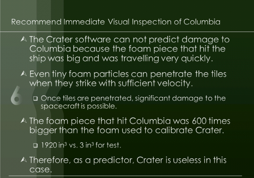
Presentation Zen in action. Above a text heavy slide cannot be saved no matter which PowerPoint theme is applied. Below the key message of the slide is illustrated by a full page bleed of a picture of the damaged tiles of a previous shuttle flight. We also enlarge and crop the foam picture. Text is set in white on a black fill for contrast. Which slide do you find more interesting, and memorable? Images reprinted from NASA.

High Signal to Noise Ratio: Inform, Don’t Decorate
Every item on your slide should be there for a reason. You are trying to inform the reader and transfer information. You should not aim to decorate your slide with meaningless fluff.
In technical terms you want a strong communication signal and very weak distracting noise in your slide. This is called a high signal to noise ratio. Normally, words, numbers, and graphs are your communications signal—the information you are trying to convey. Pictures can also be part of that signal if they are used judiciously—otherwise they become part of the noise.
Our preference is for the top slide. With no distracting illustrations the audience can focus on the content. However, the illustration in the middle slide is calm enough so as to be acceptable. The bottom slide is just too busy—it has too much noise.
Use of Empty Space: White Space Is Good!
Resist the temptation to fill every available space on your slide with words or images. White space is good! White space is pleasing to the eye and can represent balance and harmony.
However, too much white space might convey that you don’t have very much to say about a particular topic, or that it is not important. Again, it’s all about balance.
The top slide makes good use of white space to let the image breathe. The bottom slide tries to use up all of the white space and in the process horribly distorts the slide. If it looks cartoonish, then don’t do it.
Rule of Thirds
One of the advantages of using a full page bleed is that the picture is often larger than the slide. This gives you the option of positioning and cropping the picture for maximum visual impact.
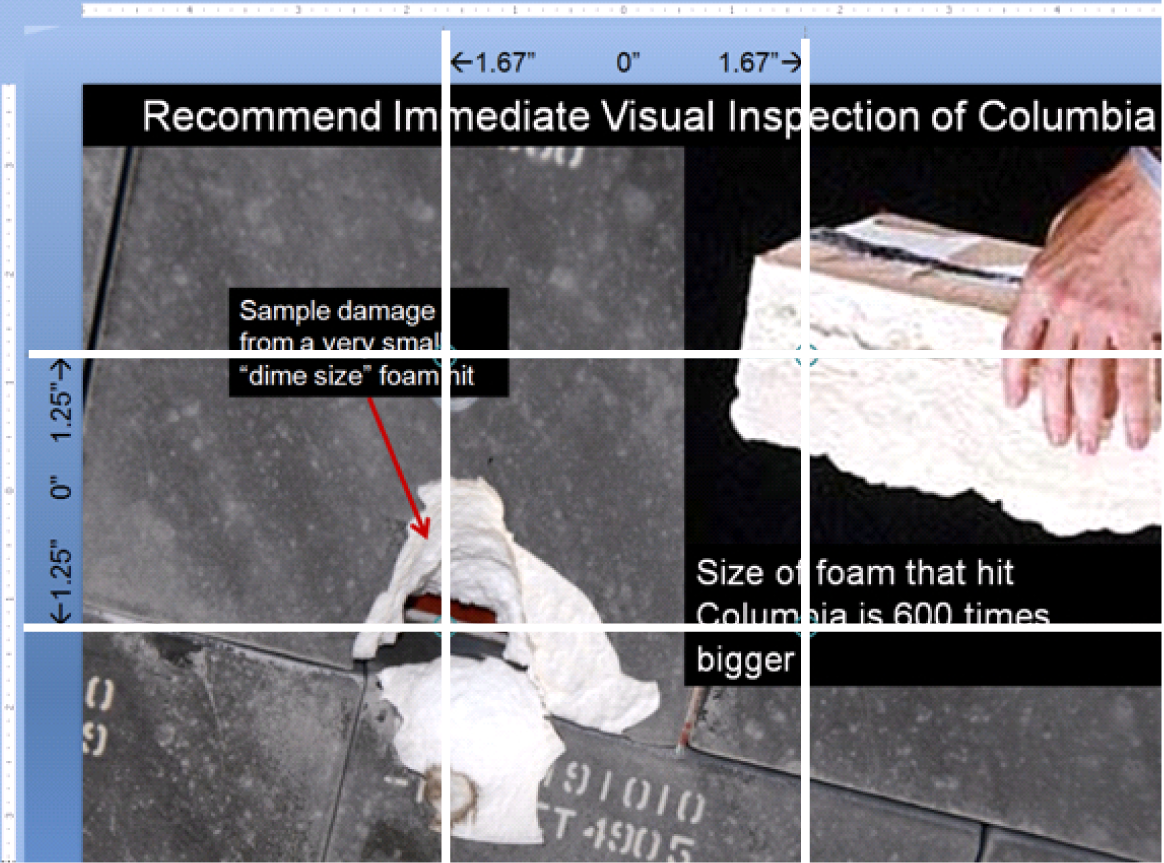
For many years professional photographers have used the rule of thirds to compose a picture, and you can too. Simply divide the slide horizontally and vertically in thirds using the guides (see technique). The place where the lines meet are called “power points.” No lie. Try to place your subject whether words or images at the power points for maximum visual impact.

This full page bleed was positioned and cropped so that the key illustrations and text would appear on the “power points” of the slide. The power points are determined by the rule of thirds.
Fills for Text Blocks
The problem with a full page bleed is that the text may be unreadable on top of the image depending on the image. One easy solution is to place the text on top of a fill. The fill may be solid (opaque) or semi-transparent if you would like the picture to show through. In either case, the fill allows you to add dimensionality to your document in much the same way that magazines layer text and graphics on their covers.
The easiest way to create this effect is to create a layout on the master slide. Reposition the title so that it completely covers a strip at the top or bottom of the slide. Then right-click and format the text box adding a fill and adjusting the text color as necessary.
To ensure consistency among slides, turn OFF the auto—fit text. Instead simply set the font size to 24 point.
On individual slides you may have to arrange layers so that the text box sits on top rather than below the graphic.
The same slide shown with black background text above and a 60% semi-transparent screen below.
Presentation Zen Resources
Check out the YouTube video below to see Garr himself present, and learn the essence of Presentation Zen.
Watch Garr Reynolds present:
www.youtube.com/watch?v=DZ2vtQCESpk
Garr’s presentation tips on his website:
http://www.garrreynolds.com/Presentation/slides.html
Garr’s blog:
Nancy Duarte, a colleague of Garr Reynolds, has written an excellent book called Slide:ology, which emphasizes similar design themes. Nancy’s firm, Duarte Design, created the multimedia presentation used by Al Gore in the movie, An Inconvenient Truth.
Free Pictures
Free pictures (and some for a fee) may be found at the following links. Please remember to cite sources.
- Everystockphoto search engine (www.everystockphoto.com)
- Flickr Creative Commons (www.flickr.com/creativecommons)
- Image After (www.imageafter.com)
- Morgue File (www.morguefile.com)
- Stock.xchng (www.sxc.hu)
In addition, as a taxpayer, you may use pictures found on most government sites as long as you properly cite them.
Key Takeaways
- Used properly PowerPoint can be an effective means of communication. However, most of the time it is used improperly, thereby creating extreme boredom.
- Think of your presentation as an illustrated version of your executive summary. By definition, your executive summary contains the key facts, issues, and conclusions of your report.
- Bookend your presentation with an agenda and a summary with conclusions.
- A PowerPoint theme will not save your presentation if the content is dull.
- C.R.A.P., Presentation Zen, and a little animation will serve to liven up your presentation and give it a professional look.
- Presentation Zen is characterized by many large illustrations, relatively little text, high signal to noise ratios, and effective use of white space.
- The rule of thirds helps to position text and images on a slide.
- You may need to modify your slide master to create an effective Presentation Zen design.
Questions and Exercises
- In what way do the Presentation Zen concepts help focus attention and preserve only the essential elements? Explain.
L3 Assignment: Professional Presentation Development
Develop professional presentation skills that you can use on the job as well as in your other classes.
Setup
Create a new PowerPoint presentation that complements your schematic report.
Content and Style
- Create an organized, clear, and polished presentation.
- Follow all C.R.A.P. and Presentation Zen principles.
- Create a title slide with your name and the date.
- Create an agenda slide at the beginning and a summary and conclusions slide at the end.
- The body of the presentation should consist of Presentation Zen slides—pictures with very few words.
- Use the Office theme (plain white background).
- Use full page bleeds for the visuals whenever possible.
- Use a contrasting fill or semi transparent screen for text boxes.
Deliverables
Electronic submission: Submit the document electronically.
Paper submission: Print handouts with two slides per page.
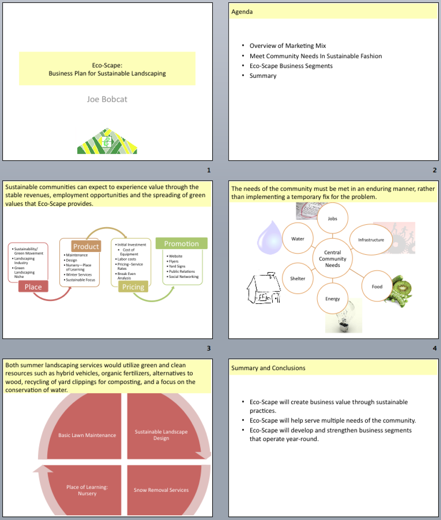
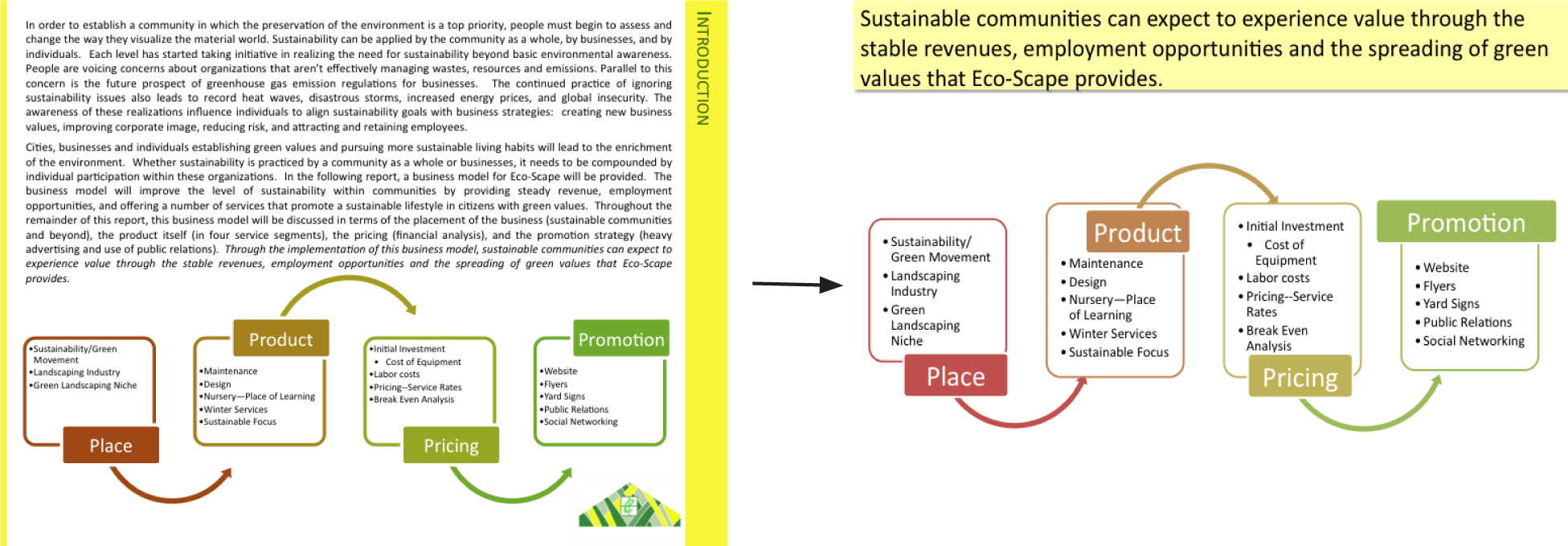
Sample student presentation made from an executive summary. Sentences from the executive summary form the slide headings. Note the graphics are the same as from the schematic report—only enlarged.